Posts

Showing posts with the label sunset

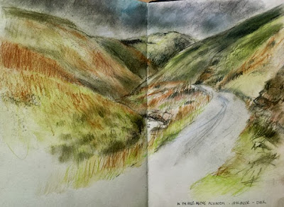
Northumbrian National Park, up in the hills, Derwent tinted charcoal pencils with waterecolour pencil
Image
The Cheviot Hills, in Northumbria, Derwent tinted charcoal pencils with a little of their watercolour pencil.  S&B  Delta sketchbook Another one from the hills, higher up than the previous one, Late afternoon with the light about to go and passing drizzly showers.  But beautiful.   I love the high hills with the dramatic, steep slopes carved by glaciers, sheep and the occasional tough breed of cattle.  Fast streams, waterfalls, isolated farms, single track road .....  I love it! I scribble a little watercolour pencil to get the underlying clear green and the basis for the sky and then worked in Derwent tinted chyarcoal - it's perfect for the colour, mood and texture of this landscape.   I really like them. Again in the lovely S&B Delta sketchbook/ And there's more ....

Sunset at Sennen Cove. oil on canvas

Image
Sunset at Sennen Cove, oil on deep sided canvas, 12 ins square I did a series of sunsets in watercolour and oil of the sunsets and it really brought out how cameras distort the colours of sunsets and aren't really at all helpful.  The silhouetted rocks and breakwater lose all colour as well. They make beautiful pictures in their own right - but they aren't the reality of the experience at all. In the photographs, there is far more red (which there wasn't in reality) and the sun is white.   In fact , the sun was blazing red and the skies were a range of softer reds and peaches and sometimes soft yellows.   So the canvasses were done quickly while the memory of the colours was still fresh.   There were vivid pale blue ripples against the darker shadows and subtle reflections of the reds in the water.  Those electric ripples were beautiful and just didn't show properly on photos.  These are 2 examples - the actual sunset look...

A quick sunset demo in watercolour

Image
A very quick sunset demo in watercolour One of my students was painting a sunset and had started with the dark clouds, planning to add the colour later.   This was a really quick demo to show her how it is better to get in the luminous colours first , so that they then shine through thin layers of cloud - just as it works in life. So ....  messy and rushed!  but hopefully it showed what I meant, with the underlying glow shining through the clouds.   If elements have to be luminous and full of light then I try to get them down first whenever possible, whether it's sky or leaves against the light. This was done in the S&B Zeta sketchbook.

scanner vs photograph Part 2 using a camera - the difficulty of copying coloured pencils in moleskine sketchbook and some solutions

Image
Final stage - using levels and colour balance to regain warmth and correct tonal values So - today is showing how I adjust the photograph in the same way as I did the scan and showing the stages. I won't repeat the stages (see yesterday's post) but the effects of scans and photos are a bit different - sometimes I like one better, sometimes the other. The warmth was put back into the image again using colour balance and the tonal values sorted out with Levels. (see yesterday's post) stage 2 duplicating layers A bit too dark in parts but this will be adjusted in levels and using the colour balance in the final version above. This has put back the darks and the pale colour in the sky that had been lost. stage 1 - an untouched photograph taken in dull natural light Much too pale and the paper much to cold and white, not the creamy colour of moleskine. I suppose I could take time to reset the white balance on the camera - but haven't actually investigated how to do t...

scanner vs photograph Part 1 using a scanner - the difficulty of copying coloured pencils in moleskine sketchbook and some solutions

Image
stage 3: Final image using scanner with adjustments in Photoshop I've been comparing scans and photographs of this little sketch of evening fields in coloured pencil in a moleskine sketchbook. I find coloured pencil can be difficult to reproduce. Scanners or cameras can pick up the top layers of colour too strongly (And I scumble lots of layers). With cream coloured paper they make it too white, using the cream for their white balance and that makes the whole image cooler. There may be better ways but this is the way I try to solve it: With the Scanner scan image into Photoshop or similar programme - I don't like to make the adjustments in the scanner if it isn't quite right, as photoshop has more options so I usually accept the scan as it is in Photoshop duplicate the layer look at options for the opacity of this laye r - this one needed 100% opacity but this is variable. This intensifies the colours without distorting them and doesn't usually darken the pa...

sunset Mawgan Porth

Image
Sunset, Low Tide, Mawgan Porth, 5 inches square, watercolour and coloured pencil on Fabriano Artistico, Vivien Blackburn A small mixed media of one of my favourite beaches. I remember walking the couple of miles to this beach with friends as a child. I wasn't supposed to! I certainly wasn't allowed this far from home. We walked there, down the steep 1:3 hill , ran about on the beach for a few hours and had a great time - and then set off home .... ..... UP that 1:3 hill. It was hot, we were tired, it seemed a long way (I was maybe 7). Then my father drove past - slowed down and glared at me - did he give us a lift home and a telling off as we went? no way! He drove on, leaving us to walk the rest of the way knowing I was in big trouble when I got home! I'm going to put this little painting on Etsy

changing light

Image
I'm taking a Christmas break but having shown you the photographs of this beach in Cornwall in changing light, I thought I would show you just some of the sketches and paintings of the beach in different weather and at different times of day. for a longer write up please visit our group website watermarks :>) where I'll go into more detail about limited palettes, working plein air, size and medium, light, time and tide ...... I hope everyone had a great Christmas I got some lovely new art supplies to play with :>)

watercolour seascape: sunset across the beach

Image
Sunset, Ebb Tide, watercolour, Vivien Blackburn Sunset, looking across the beach as the tide ebbs and the pools of water reflect the sky. I haven't used watercolour for a while and fancied playing with the way that the colours merge and flow and glazes of transparent colour create colours it's impossible to name - just like the sky in real life. There's a lot of aureolin yellow in there - a lovely transparent yellow when used thinly. There is also a very little watercolour pencil and a little pencil added at the end. I do like watercolours - I should remember to use them more often and get a bit more practice in! you can see some other work on Cornwall here http://vivienb.blogspot.com/search/label/Cornwall .

charcoal and coloured pencil beach, evening light

Image
Evening Light across the Beach. Vivien Blackburn. Charcoal and coloured pencil This is the charcoal drawing on grey paper that I showed you unfinished here: http://vivienb.blogspot.com/2008/02/seascapes-update-february.html (scan down past the painting to it) I said that I was mulling over whether to simply use white pastel for highlights and keep it monochrome or add colour - and if colour what medium??? I decided to try coloured pencils over the charcoal and see how they worked - they worked! I wanted to keep the colours very muted, this kind of evening light softens and dulls colours and the cliff was deeply shadowed and backlit. I worked in multiple glazes of colours to softly build white, blues, mauve, umber, sienna, peach, orange, ochres and a little green on the cliff top which doesn't show much onscreen as it's only a little. The peachy colours are a little less orangey and more peach than they appear here. The clouds have blues and browns in them. The light blues in ...

charcoal, sketch looking across the beach at sunset

Image
Across the beach, sunset, 16 ins square, charcoal on watercolour paper. Vivien Blackburn A quick sketch in charcoal with some conte pencil to push the darkest areas. I used watercolour paper which didn't grip the charcoal very well. The texture worked ok for the sand but was sometimes annnoying in other areas. The sand has a little more tone than shows in the photograph - again the flash bounces off the white paper, lightening it >:>( details:

update on seascapes, works almost finished

Image
Sunset, incoming tide. Vivien Blackburn. mixed media on canvas This one is virtually finished. Some of the colours aren't showing very well, like the greenier blue on the underside of the waves. It's now hanging above the sofa so that I can decide if I'm going to do anything further to it. That's its working title, which may stick. I'd said these smaller canvasses were 30 inch squares and I've realised they are probably 24 inch squares - maths never was my thing! I do know for sure the bigger ones are 40 inch squares :) Through the Dunes Nightfall. Mixed media on 40 inch sq canvas. Vivien Blackburn This is still wet and so the light is catching the wet paint a little but I'm not planning to do much more to this. (the curved shape on the lower left hand edge is something in front of the canvas and not part of the painting) The other 40 inch canvas is also virtually finished. The disastrous one of the last post has had the sky/clouds sande...

some sunsets in cornwall

Image
images copyright VivienBlackburn these are a few of the sunsets seen from the windows of 'our' flat - the cloud formations were often fabulous. This one is low tide with the light reflecting off the pools and shallow water at the edge of the surf. This was a clear and cloudless sunset, turning the sky apricot and the colour reflecting on the sea. (high tide) The strange rectangle in this one is from the mirror on the wall behind, reflecting the light onto the glass. Between the photos and my sketches I'm hoping to paint a few sunsets :) - the problem with photos is that they can't cope with the tonal range that he human eye can - metering to get the sunset colour means losing detail in the cliffs, rocks and foreground - there wasn't much as the light was going but there was more than this. Putting colours down in a sketch in this light was interesting - the colours were far too lurid when looked at in the morning! they'll need toning down quite a bit. I...

Time and Tide: sunset and pools at the beach

Image
This is one of the recent ones in the Time and Tide series, a smallish one of just under 3ft tall. It's about those evenings where the clouds and colours are patterned and vivid, layers of different coloured clouds, delicate peach pinks, small fluffy clouds that are lower and the pool reflecting it all. The pattern element was important as it was that sort of evening. It makes me think of Fairisle knitting! It works well with the others in the series. What do you think? Daughter and new son are both doing well and she's so happy :)

last light, moleskine and coloured pencils

Image
I should be doing lots of things instead but I wanted to draw - so I did :) ... and now I have to face the dirty dishes, pile of washing and tidying up :( I did this from a combination of the sketches I did on the beach at sunset and memory. I've done a series of works from those sketches - in oil, pastel and digital images. It was interesting to see just how intense and dark it's possible to go with coloured pencils. I think they hold up well in comparison with other media. I'm speeding up with them and can now imagine sketching more with them plein air. I think they'll feature more often in my sketchbooks in the future. It was done with a mix of Polychromos, Lyra and cheapo Tescos coloured pencils and one Derwent. I like the heavier waxier Polychromos and Lyra - in future I'll know which to go for. Luckily I took the advice of expert CP users and bought quite a few polychromos - the Derwent is an old one, though it's good I don't like it...

sunset in the shires

Image
Done on the way to the evening class I was teaching, I had some spare time and the sunset was lovely. I only had those skin tone Lyra pencils and Moleskine to draw it with, so I sketched with them, making colour notes and then added the extra colour later (blue, purple, orange, yellow and green) - using the coloured pencils in the art room at the college - they were nasty scratchy Verithins so not as nice to use at all. It fixed the scene in my memory though. I'm wondering whether our local pastel society allows coloured pencils in the exhibition - I have to have 3 for a show coming up and it would be nice to include a CP one if it was allowed - charcoals and conte are allowed - it's more about being a dry drawing medium - so I wonder? I'll have to make enquiries.

experimenting with photobucket slide show

Image
It worked! so this show is done with photobucket, where my images are stored to go online anyway, so access is quick and easy. Anyone wanting to add a slide show to their blog, and who isn't already light years ahead of me in technology and knows already :) , can join the sites and create their own by simply clicking on the 'get your own' tab next to the images Apart from the pencil sketch these are variations on the beach at nightfall, from sketches done plein air. There's a small 12 inch square oil painting, some collagraphs and a pencil sketch of the sea defences. Collagraphs are a lovely printmaking method using mount (matt) card as a plate. It's inexpensive and I really like the marks you can achieve with it. It does need a printing press though as it's an intaglio process like etching and not a relief print like lino.

Today .... pastels

Image
I spent the afternoon painting :) - ignoring the fact that I really should have been tidying up It's based on sketches done sitting on the beach as the sun set and night fell, and memory, it's the last of the light, just catching the sand and sea and clouds. It's only 11 inches square in a black leaved sketch book by Pink Pig, using Unison pastels (I love them best) and compressed charcoal to regain some of the blacks. Unison pastels are so luscious and don't constantly break like some pastels. I know a lot of people like Rembrandt pastels but I found they just constanly broke and shaled into little pieces and were a bit scratchy feeling to draw with. A very good pastel painter told me that Schminke white is the whitest white of all with brilliant cover so I plan to treat myself to a couple when I'm near a supplier and see how I like them. I do love working in pastel but .... oh the framing of it! it's a nightmare. I may just get my framer to do this one comple...