Tonal values: Light and shade, a key element in making your paintings and drawings better, 2 of 10
The cliffs at Hunstanton in greyscale to show tonal values
Tonal Values
Getting to grips with tonal values is essential to capture your subject in an interesting way.
The original version of the striped cliffs at Hunstanton in colour
You need to use the full range of tones observable - this may be a limited range as in a subtle Gwen John interior (below) or a misty day - but more often has a wide range of contrasts. I find students are often wary of pushing the darks enough and the finished work lacks impact - deepen those darks (with colour not black) and the painting comes to life.
Gwen John
Half close your eyes to simplify tonal values and capture them with more ooomph. Colours are a totally separate issue from tone - yellow in the shade can be darker than black in sunlight - it's essential to look and compare, squint, really observe closely and don't simply think of the colour your left brain knows the object to be. The effects of light can make it appear a very different colour and tone. Constantly compare - the small hole punched in paper for filing can be useful to isolate an area so that you can assess it without preconceptions creeping in.
Remember as well that a camera can't cope with the number of tones a human eye can. If a human eye can see 10 degrees of tone then a camera catches less than half. Some areas disappear into blackness - black holes where the human eye would see colour in the shadows. Some areas get burnt out - skies too pale and washed out for instance - whereas the human eye sees the colour and tone. So, if working from photos a lot of visual memory needs to be drawn on to add back the missing elements.
Read this article on Handprint to see a scientific and interesting explanation of our perception of tonal value
Caravaggio
Caravaggio is an absolute master of contrast, with parts of the subject lost in darkness, faces and hands gesturing are brightly lit adding pure drama to the scene being enacted as though on a stage.
Consider the very different mood that the tonal values (and marks) evoke in these paintings and the one below.

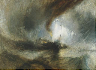
Turner
Just look at the clever use of tone in this painting by Turner - he's used it to create a vortex, all marks and tones leading you to the ship in difficulties, the light areas silhouetting it, the dark swallowing it without clear distinction between boat and sea. Again, tone to add pure drama.
Do take a look at Turner's sketchbooks at the Tate if you haven't done so - here. They could have been done today, amazing, free, timeless, so well observed.
This is a study I did of a studio space I had about 12 years ago and below is a greyscale version.
As with the Gwen John interior the light was diffused. The space was cluttered with a shirt over the back of a chair, a vase of wiliting flowers and a tin of brushes, the window at the back but probably fluorescent lights lit as well.
close up of the brushesm backlit by the window and below in grescale
Tonal value also creates a sculptural sense of form
With these studies of cardoon heads I wanted to get the volume, the robust heavy shape, the different textures - scaly dry bracts and fluffy interior - tonal value (and observation and mark making - see they all interlink!) is what I used to try to achieve this. I felt I was sculpting with the pencils, interpreting a 3D subject in 2D but trying to make it feel 3D, pushing the bits of darkness behind the bracts to make them come forward, using light over dark as well as dark over light in the fluffy areas. My little electric erasers are brilliant for this. I've got a Jakar and a Derwent one.. The Derwent spins a little slower, is a little wider and has longer refills.
The same issues of volume and form apply to any subject - portraits or landscapes.
Other artists that might interest you
Kurt Jackson's landscapes are full of light and shade, beautifully observed. Reflections on water are especially fabulous :>) (also intense observation and lovely mark making)
David Prentice both traditional and abstracted work - but the tonal values are as important as the colour
If painting/drawing an abstract, tonal values still apply. The overall painting still needs to work tonally it's a balancing act even though it isn't related to some concrete object, view or person being observed directly.
Mary Fedden flattens perspective, isn't concerned about 3 dimensions but her paintings still consider tone as well as colour and composition.
Barbara Rae abstracts from the landscape in wonderful vivid colour - but again the tone works. Take a look at her wonderful sketchbook, sadly out of print - I was tempted to buy : > )
To make an interesting painting, the light must be interesting in the first place, giving interesting tonal variation and shadows.
It's worth lighting a still life with lamps or positioning it sideways on to a window - or backlit for drama.
In the landscape evening and morning light is far more interesting than the flat light of midday. It has long shadows and a special quality to the light whereas midday - especially in summer - can be just plain boring to paint and results in a boring painting.
Prior posts in this series
Post one of this series an overview
Post two - on observation
More to follow with points 3 -10 : > )


Comments