card competition
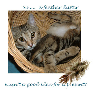
Playing with ideas for a card competition - This is madame when she was young, playing in a waste paper basket. I'm looking at the photo part of the competition as the artwork side is very very simplistic and graphic and not 'me'.
The font needs playing with and making more interesting I know - that's just to get the idea down.
Captions aren't easy! any thoughts?
The font needs playing with and making more interesting I know - that's just to get the idea down.
Captions aren't easy! any thoughts?


Comments
How about:
Feather duster!
What feather duster?