Posts

Showing posts from February, 2011

STILL LIFE CHALLENGE and Pentel brush pen with charcoal, still life
Image
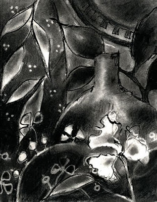
Still Life in willow charcoal, compressed charcoal and Pentel Brush Pen, 8x10 ins, Vivien Blackburn In discussions with friends recently I was reminded how nice the Pentel Brush Pens are to use - so I treated myself to a new one. The old one has long since been mislaid. It arrived this morning and so before doing all the stuff I should be doing, I had to have a play with it :>) I used to really like combining the brush pen with charcoal for all the lovely tonal variations and marks possible. The nearest thing to grab to work on was the work in the recent still life series - so here is a monochrome version done in willow charcoal, compressed charcoal and the brush pen. What do you think? The pen has a lovely fine point so it's possible to get a lot of line width/weight variation - finer than I remember. I bought the pocket sketching one - maybe that has a finer point than the regular one? I have to say that much as I love colour, I also really enjoy working purely tonall

still life update

Image
detail I worked a bit more into this one - I like using coloured pencils but sometimes the effect can be a little flat to someone who likes marks - so this one has more loose marks with the Caran d'Ache than the purely Polychromos coloured pencil one done earlier. Here are some details to show the scribbliness. Is that a word? :>) further detail current progress The A3 page in the moleskine as it currently stands - I think I'm going to add a purplish border - you can see the tentative start of it on the left of the page. What do you think? another detail James Gurney has an interesting article about the contents of his sketching bag today - interesting to see it's not too minimal! (as one who takes too much) Billie I did harden some lines you'll notice :>) thanks

The Postcard Exchange - A Postcard from my Walk

Image
My postcard from Martin Stankewitz - isn't it gorgeous? I'm taking part in a postcard exchange, where the 14 members of the group paint/draw a postcard each month and send it on to another member. So the whole exchange will take 14 months. This is the first card to arrive for me, a delightful wintry, rainy day in Germany by Martin. It's beautifully free and loose and expressive and I'm delighted. This first month of the exchange we did a direct exchange - so Martin received this one from me. From now on the names are scrambled and so I don't know who the next one will be from - just who I'm sending to , I can't wait! The whole thing was set up brilliantly by Katherine and Ronelle . A Postcard from my Walk blog - you can follow our progress here if you want.

still life with caran d'ache neocolor II

Image
Experimenting with Caran d'ache Neocolor II in the A3 moleskine sketchbook - the paper tolerated me using water with these in the underlayers.

non traditional still life continued - another digital variation - and googleart

Image
Digital variation, Vivien Blackburn I fancy working from this one with scumbled paint over a coloured background. It needs to be either oils on canvas or pastel over paint I think. I love it when underlying layers of colour show through :>) And google ar t is waaay too addictive Look at the close up you can achieve of paintings, like this one of Turners. It's a fantastic site - how else could I visit the Tate, the Hermitage, The Rijksmuseum and the Uffizi and see pictures by moving around the gallery, and then closing in for a better view, without moving from my chair?

non traditional still life continued: experimenting in coloured pencil

Image
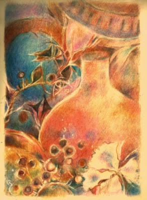
Copper and Rose, coloured pencil, A4 folio moleskine, Vivien Blackburn details close up: Using coloured pencils I developed the digital experiment , not copying but making some alterations to shape, pattern and colour. I wanted to develop the warm coppery, rosy glow in this one with the blue as a supporting element, not the main one. It's in the large A4 folio sketchbook. I like the way coloured pencil behaves on the waxy paper surface. It may not allow quite so many layers as a paper with tooth but it allows quite a lot. The surface of the vase contains probably 10+ colours glazed over each other to change the warmth and colour balance across the surface. It also allows the Jakar battery eraser to lift the colour effortlessly for 'drawing' back in by removing colour. I think I'll do some more of these in coloured pencil (as well as paint and pastel) as I've got a pastel society exhibition coming up and pencil is allowed :>) feedback? what do you think? I

non traditional still life variations and maybe a challenge?

Image
Blue still life version 2 , watercolour and mixed media with copper metallic Sennelier oil pastel, Vivien Blackburn Another version from the same starting objects - playing with blue leaves from a vase pattern (top left) and green real leaves (top right), with the pattern of the cloth and plate floating, weaving in and out and elements used wherever I wanted them rather than where they actually were. Hillary asked if I minded her doing a theme like this with her group and I suggested she leave a link to the work they did in the comments section . Challenge: Does anyone else feel like having a go? a challenge? I haven't thrown out one of those for a while. Have a go at playing with still life items in a non-conventional way and then post a link in the comments on this post and later - about a month or 2??? - I'll do a post with links to everyone who took part. For ideas and inspiration look at the list of artists on the earlier post and then find some others you know and

still life, non traditional approach digital manipulation

Image
Copper and Rose, digital image, Vivien Blackburn I experimented with the image from yesterday in the computer and this is one variation I came up with. I love the colours in this one - I must do this as a large painting. Still life is definitely starting to interest me!

Non-traditional still life - thinking through ideas

Image
Blues, mixed media still life, 8,5 x 11 inches, Vivien Blackburn , media: watercolour, oil pastel, caran d'ache neocolor II The group of friends I meet up with once a month are doing a still life project. We've set ourselves this task to take ourselves out of our comfort zone and make us all try something different. Each has their own particular interests in subject matter - which doesn't really include still life. It was my idea ........ will I live to regret it? We'll all be looking at it with our own particular viewpoint/angle/ideas. I'm working out what approach I'm going to take, I don't want to do traditional set ups as they don't 'grab' me to do. I do like the way some contemporary artists play with the patterns, shapes and colours and that's the way it will interest me. This is my start on the project - ongoing work to be shown at next month's meeting. There is more variety of blue in real life. I've taken the patt

catalogue design

Image
Catalogue design in progress - my page and the cover in progress I'm busy at the moment creating an A5 catalogue for our small group for an application we are putting together. We'll each have a page for a statement, one large image and 3 small, plus contact details/website (blurred here) Text is grey. The grey squares will show the other members work when finished. I may change my images, it's yet to be decided. I'm using Publisher I think I may have it ring bound but haven't quite decided yet. To ring bind or staple? (and I haven't got a long arm stapler) What do you think? I want to keep it clean and simple. Comments welcome :>)

Hoar Frost, Misty Morning: Mixed Media Painting

Image
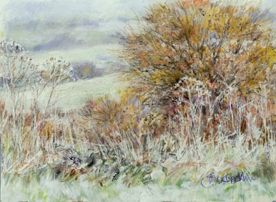
Hoar Frost, Misty Morning. Mixed media. 9.5 x7 inches. Vivien Blackburn This was a beautiful early morning, with mist across the fields and all the dried foliage covered in a fine coating of hoar frost. I wasn't certain if I could catch it - so ethereal, so pale and cold, distant hedgerows floating in the pale green/whiteness but with the trees vibrant, the sap beginning to rise, glowing in the January landscape. I worked initially in acrylic, with touches of coloured pencil and a little oil and my trusty tippex pen to catch the frosted vegetation against the deeper bushes and trees. It's part of our postcard exchange and has now arrived at its destination - see here. I'm really looking forward to the postman arrived with my card :>). This time from Martin - but for the rest of the time the exchange runs (14 months) the sender will be a mystery until the card drops through my letterbox, exciting! Incidentally - shooting in RAW is something I have to learn.

scanner vs photograph Part 2 using a camera - the difficulty of copying coloured pencils in moleskine sketchbook and some solutions

Image
Final stage - using levels and colour balance to regain warmth and correct tonal values So - today is showing how I adjust the photograph in the same way as I did the scan and showing the stages. I won't repeat the stages (see yesterday's post) but the effects of scans and photos are a bit different - sometimes I like one better, sometimes the other. The warmth was put back into the image again using colour balance and the tonal values sorted out with Levels. (see yesterday's post) stage 2 duplicating layers A bit too dark in parts but this will be adjusted in levels and using the colour balance in the final version above. This has put back the darks and the pale colour in the sky that had been lost. stage 1 - an untouched photograph taken in dull natural light Much too pale and the paper much to cold and white, not the creamy colour of moleskine. I suppose I could take time to reset the white balance on the camera - but haven't actually investigated how to do t

scanner vs photograph Part 1 using a scanner - the difficulty of copying coloured pencils in moleskine sketchbook and some solutions

Image
stage 3: Final image using scanner with adjustments in Photoshop I've been comparing scans and photographs of this little sketch of evening fields in coloured pencil in a moleskine sketchbook. I find coloured pencil can be difficult to reproduce. Scanners or cameras can pick up the top layers of colour too strongly (And I scumble lots of layers). With cream coloured paper they make it too white, using the cream for their white balance and that makes the whole image cooler. There may be better ways but this is the way I try to solve it: With the Scanner scan image into Photoshop or similar programme - I don't like to make the adjustments in the scanner if it isn't quite right, as photoshop has more options so I usually accept the scan as it is in Photoshop duplicate the layer look at options for the opacity of this laye r - this one needed 100% opacity but this is variable. This intensifies the colours without distorting them and doesn't usually darken the pa