Posts

Showing posts with the label pastel

Near South Stack, pastel plein air

Image
South Stack, near Holyhead, A3 pastel plein air  This is at the framers at the moment,  in preparation for an exhibition, along with lots of other work from the week painting in Wales.  It will be going in a lime washed frame. Vivid memories of a lovely day sketching on the cliff with friends somewhere near, doing their own views - that's a steep drop down via the path and then another steep cliff edge.  One friend was working down there, another much higher up looking way down at the lighthouse (just out of sight on the right).  What did we do before we had mobile phones?  so easy to coordinate coffee breaks and moving on when we spread out and aren't near each other. I used a sheet of Sennelier sanded paper for this and the Rembrandt and Inscribe pastels I'd thrown in at the last moment.  Oh dear, I did NOT like the Sennelier paper - luckily I'd swapped a sheet with a friend as she didn't like it and I got to try it without having to buy a ...

Summers sort of here so of course I'm painting snow

Image
snow ...... I've neglected my blog - I'll try to post slightly more often.  The warmer weather is here - so of course I get interested in snow.  It started because of a trip to the Cotswolds to see a Kurt Jackson exhibition in April - there was incredibly late snow on the hilltops looking wonderful.  That led to one painting and made me revisit sketches I did of a very early snowfall one November and work further from those.  November Low Sun, EarlySnowfall approx 15 inches square, pastel This is from the sketches done when we had and unusual very early snowfall in November, when there were still hints of autumn colour.   As I looked at the field a flock of birds took off,  The light in the sky was glorious and the patterns of the ploughed field - everything just added up to one of those perfect moments.   Dusk, November, Early Snowfall tiny one, approximately 5 inches square, coloured pencil The birds have flown and th...

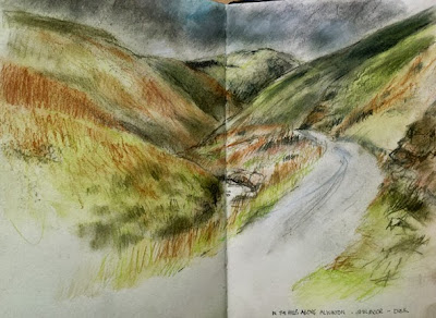
Northumbrian National Park, up in the hills, Derwent tinted charcoal pencils with waterecolour pencil

Image
The Cheviot Hills, in Northumbria, Derwent tinted charcoal pencils with a little of their watercolour pencil.  S&B  Delta sketchbook Another one from the hills, higher up than the previous one, Late afternoon with the light about to go and passing drizzly showers.  But beautiful.   I love the high hills with the dramatic, steep slopes carved by glaciers, sheep and the occasional tough breed of cattle.  Fast streams, waterfalls, isolated farms, single track road .....  I love it! I scribble a little watercolour pencil to get the underlying clear green and the basis for the sky and then worked in Derwent tinted chyarcoal - it's perfect for the colour, mood and texture of this landscape.   I really like them. Again in the lovely S&B Delta sketchbook/ And there's more ....

Using the iPastels app in ipad, my review

Image
sunset study with the Pastels app on ipod The ipastels app on the ipad is good to use, a definite keeper.  If you like using pastels this is defintitely worth trying out. I've downloaded several .....  umm  quite a lot.... of apps to try out, those that I don't like will be deleted eventually. As I've downloaded this I can't tell if it was a freebie or a bought one, sorry but it doesn't show any more once it's purchased - but the prices for any I bought were very low, all under £3. It's very simple to use with all the options clearly laid out and quick to access. You can work on different layers, preserving the layers beneath while you experiment.   I haven't used this yet but have worked in a similar way in Photoshop and know how handy it is. The image above was done on a single layer. You can vary the stroke width and pressure, meaning colours mix very naturally, thin veils of colour can be laid down and subtle transitions made, the sm...

Life Drawing, Charcoal and pastel

Image
The latest life drawing - it will not photograph well for me - there is a soft cream in the highlights but they are reading too garishly :>( Done with willow charcoal, compressed charcoal and cream pastel. Again about 90 minutes work, I wanted to concentrate on the 'portrait' aspect with this one. Charcoal is such a lovely medium to work with, messy but so adjustable. I can sweep mistakes away with a brush of my hand (yes I do get very grubby) and redraw, draw back in with an eraser to paint lights back in and be really flexible. I edit. A Lot. We've got the same model, Lucy, very chatty, again next week, with the same pose for those who paint and work slower. So I'll choose another view.

gnarled root, drawing in charcoal, pastel and coloured pencil

Image
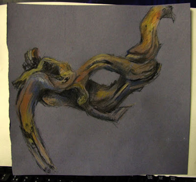
Gnarled tree root, drawing in charcoal, pastel and coloured pencil , approximately 11 inches square Drawn with Pitt charcoal/graphite mix pencil, with touches of pastel and coloured pencils on blue grey pastel paper. It was an amazing shape to draw, fluid and convoluted. We were experimenting with creating landscapes from still life objects. I don't much like the piece I did from this so may rework it before showing it here. I also did a very quick landscape sketch from a flintstone, this time without a preliminary observational sketch. I'll scan that later.

Old church graveyard, drawing in charcoal and pastel

Image
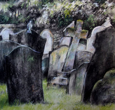
Old Church Graveyard, charcoal and pastel, approx 16 ins square, Vivien Blackburn An old churchyard in Norfolk - again done in charcoal (willow and compressed) on pale grey paper, with touches of pastel for a little colour. I think it's a subject that works with this limited colour scheme. I do love charcoal. The textures and marks on the stones and the lovely light interested me - and the pigeon obligingly posed :>) details: just done because it interested me - I don't suppose many would want a graveyard on their wall???

Thistles, drawing in charcoal and pastel

Image
Thistles, charcoal and pastel. 23x14.5 inches, Vivien Blackburn A much larger than life drawing of thistle seedheads at nearly 2 feet across. The seedheads look so lovely when you look at them closely - the flyaway softness contrasting with the spiky leaves and prickles. I really enjoyed drawing them - I think I'll do some more. Below are close ups to show the detail better I was hoping my artichokes might produce flowers this year (their second year in the garden) but they've not done much growing :>( I really fancied drawing them as buds/flowers/seedheads.

Painting and Drawing Trees: observation

Image
Sketching Trees in the Park. Rotring fountain pen in A4 sketchbook. Vivien Blackburn This is an old sketch done in a local park. I was trying to describe the different types of trees and their distinctive shapes, character and foliage with just pen lines. Looking back at it I like the positive/negative changes with light trunks against shadowed foliage and dark trunks against light, changing back and forth. That poor Rotring pen hasn't been used in a long time, maybe I should dig it out. I really prefer less scratchy media. I like trees - not quite as much as water but nearly! Trees can have very distinct character, rather like people and I really dislike the generic woolly trees in some 'how to' books. I've dug out some of the trees I've done over time - some, like this (done in '93) done some time ago and some more recent. They are in pen, pencil, charcoal, watercolour, oils, digital imagery, coloured pencil, ink, mixed media, acrylic, pastel, don...

Links to artists taking part in the sketching Skies from Observation Project

Image
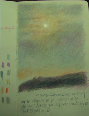
Dawn at Sennen Cove, coloured pencil in Moleskine sketchbook, Vivien Blackburn Quick sketch of the sun burning through the dawn clouds in coloured pencil in a moleskine sketchbook. The colours used are on the left hand page. As promised - Links to the participants in my skies challenge. The challenge was to paint skies at different times and in different weathers - from observation not photographs. No particular order here, just added as they arrived :>) There is some lovely work so do take a look Dinah Mow sky studies and more here Laura sky studies Jeanette sky studies Sydney sky studies Doug sky studies and Katherine Tyrrell gave me these links: Canary Wharf Sky 31st January 2007 - Canary Wharf Sky from Greenwich 31st January 2007 two - Canary Wharf Sky - 4.51pm, 8th February 2006 and Canary Wharf Sky - 7.55am, 2nd January 2007 in Advice for Artists Canary Wharf Sky - 3.47pm, 6th December 2006 Canary Wharf Sky - 8.24am, 13th January 2006 Canary Wharf Sky - 4.52pm 18th Novem...

pollarded willows, pastel, framed

Image
I decided to frame the pollarded willows with a little more of the work showing - this is it popped into a frame, showing the new crop. Sorry about the reflection from the window/door! Framed it's just over 2 feet (guesstimate) you can see the previous crop here I think I'll change the mat to a slightly deeper wheat colour to match the field beyond the water. I think it looks better larger - how about you?

Those pollarded willows again - in pastel

Image
Pollarded Willows, Aylestone Meadows, Pastel. approx 16ins. Vivien Blackburn Another look at those pollarded willows. Behind me is the canal, just a few feet across the towpath and in front is Ulverscroft Brook. The dried grass of the winter field was pale in the bright light and the sky a pale cold blue. Late afternoon sun warms the sunlit side of the willows with an amber light. The patch of darker blue sky on the top left is a shadow not part of the painting. c&c???

Drizzly morning, clearing up, pastel

Image
Drizzly morning, clearing up pastel on Pink Pink paper, approx 12 ins square, Vivien Blackburn I need 3 pastels for a show next month and set out to do a large piece based on the pollarded willows. I got half way through one and it's at the ugly stage just now and needs thinking time, so I got side tracked into completing this one. The attention span of a gnat Never mind! this one can be one of my 3. It's mostly Unison pastels as I love them - velvety soft and rich but they don't break up and flake away to expensive shards and powder like some. What I do want to get is some white Schminke pastels, as I'm told they are the richest, whitest white with brilliant covering power. I often underpaint when I use pastels but this one is just pastel and no other medium. I love pastels with the mix of drawing and painting they allow - my skin doesn't like them much though and dries out terribly. I've tried wearing those thin disposable gloves but I use my f...

Linoprinting - with a bit of virtual linoprinting too

Image
Linoprinting Linoprinting isn't my favourite form of printmaking but I felt like doing something different, something outside my comfort zone. Lino creates clear sharp graphic images and I am more comfortable with more painterly printmaking methods, particularly collagraphs and etching with aquatint but they do need a printing press and lino doesn't. This is the lino itself, I coloured the raised parts with waterproof ink to help me to see how the cut what going - the paler blues and mauves are actually cut away -that's just the remains of some acrylics that I tried that you can see. Printmaking is quite time consuming - there's a lot of 'process' - but once the plate is made, a number of prints can be produced from it. The number depending on the fragility or not of the lino plate . The idea is that you cut away any area you don't want to print. The areas you leave behind will be inked, usually in one solid colour but it is possible to do very effective gr...

playing with colour fields in pastel, harmonious and complimentary colours

Image
Colour field experiments in pastel on pale grey paper. Golds and blues. Vivien Blackburn Colour field experiments. Pastel on grey paper. Blue, Violet and Gold. Vivien Blackburn These small pastels - just over 5 inches square, were pure 'playing' with colour interaction - taking complimentary colours and making vibrant little squares of colour as the complimentaries zing against each other. The second one hasn't photographed very well - the magentas are much more glowing in reality than they appear here. Colour field experiment in pastel on grey paper. Greens and Russet. Vivien Blackburn The last one makes me think of apples and autumn, the middle one of beaches on one of those deeply vivid blue days and the first late summer harvest time. They were done with Inscribe pastels, which is a very cheap brand but really nice to use and with a wide colour range, I use them alongside my Unisons. I do love the vivid colours of pastels and the kind of marks they make - that lovely...

sketching plein air and then playing in Photoshop

Image
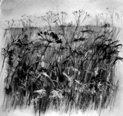
I scanned the plein air sketch on the right below into the computer and then desaturated it and manipulated it a little (above) - and now I'm working on a large charcoal sketch based on it. It was quite windy and the tall grasses were bending and I want to get the feel of this into the bigger drawing. I do like charcoal :>) so I'm looking forward to working on this. I sketched again near where I did the cowparsley and fields of rapeseed (the 2 left hand pages) - the fields are no longer yellow, the flowers are almost gone now and the cow parsley is starting to go to seed (right hand page). Things change so quickly.

plan chests, old and new work - pastels still life and charcoal drawing of hands

Image
drawing hands in charcoal - over life size, A1 paper - also featuring my lovely plan chest! This shows part of my plan chest - the large sheet of paper - A1 - is lost in the large shallow drawers, they take huge A0 sheets :>) A1 is the size of 8 sheets of typing paper side by side. One of the fun things of starting to load work into the plan chest was in unrolling old drawings and finding stuff from the degree and pre-degree - not seen in years! This one was a uni challenge to draw our hands - here revealed are my horrible chubby paws :>o - We had to draw our left hand with our right and vice versa. Any guesses as to whether I'm right or left handed? a much older pastel drawing I came across - about 2ft 6in tall -ish. This was done at a weekend workshop. It doesn't show up well in the photo but that really does look like velvet on the seat in real life. It brought back happy memories of a friend who died last year and the fun we had on the course. Feathers an...

making a sketchbook and sketching in the landscape

Image
A sketch of the Leicestershire landscape, fields of rapeseed glowing with their bright yellow flowers against the hazy blue distant hedgerows and woods in the evening light and clouds of cow parsley in the fields edge. Pastel sketch in my new hand made concertina sketchbook. Vivien Blackburn I managed this sketch of the local landscape between classes yesterday. It was early evening and the distant woods and hedges had that mauvey blue tinge and the fields of yellow rapeseed glowed. The roadsides are a mass of flowers - particularly the cow parsley. I've been meaning to get out and sketch before the yellow flowers are over. In this part of the county it's grown a lot and some areas become almost totally a glowing yellow - some love it, some hate it and a lot suffer hayfever because of it! (I'm on my Telfast antihistamines, sniff) I made myself a sketchbook from Lindsay's brilliant instructions - look here: http://straightlinesout.blogspot.com/2008/04/modified-concertina...

sketching everyday things part 2

Image
Feathers. Sketches in pastel, pencil, brush pen and coloured pencils. Vivien Blackburn I'm back at work and feeling distinctly convalescent! not up to tackling a large canvas - but twitching to do something. so I sketched thisfeather, which was a present from this little tiger - who has eyes for the pigeons but isn't capable of catching one - so she brings any feathers she finds into the house to play with. Hence its rather raggedy state. I simply had a play with various materials, looking at the feather again and again in pastel pencil, 2B pencil, Pitt brush pen and coloured pencil. With the brush pens and coloured pencil I just decided on an equivalent tonal value of pen for the various greys and blacks of the original and substituted a warm amber/honey for the lightest parts and deeper umbers for the blacks with no attempt to use the original colours. I really like the texture of feathers to draw :>) .

Teaching and Learning Styles part 3

Image
class website: Welland Park students, tutor: Vivien Blackburn This is a website I set up for the classes to show off their work - you'll see the wide range of subjects, media, styles and experience - the differentiation I talked about in my last post on teaching styles. website address: http://sitekreator.com/wellandpark it's worth a look - there are some talented students in my classes :>) previous posts on teaching in this series: http://vivienb.blogspot.com/search/label/teaching (2 posts) and http://vivienb.blogspot.com/search/label/teachers where I talk about the good teachers I've studied with . Core elements in painting and drawing Teaching I believe is being a catalyst. You are aiming to bring out and develop the talents and increase the understanding of students. Core elements for me are: encouraging an open minded exploratory attitude from the very beginning (a relaxed atmosphere as explained in the first post, enables students to do this without fear of...