Posts

Showing posts from 2011

Digital image: Twilight woods

Image
Twilight Woods.  Digital image A complex mix of various of the samples done with the Derwent pencils and ink sketches.  This doesn't exist anywhere but in the computer - I do like tangled undergrowth like this and did a whole series of work on the theme in my final year of my degree - something I'd like to work on again a little.   On big canvasses.   And maybe focussing in on details as below: I'm making no New Year resolutions other than to go with the flow :>)

merry christmas

Image
Merry Christmas A Christmas doodle in Derwent metallic pencils on their black sketch pad - yes another with the items they sent me : : >) I'm having fun working my way through their products : >)  at the moment all is in a trying-it-out-in-small-things-stage - I'll manage some larger works after Christmas.

City Lights: night time sketch on black paper in mixed media

Image
Lone figure, city night sketch, December, inktense, coloured pencil and white gouache on black paper, A5 ish I've been meaning to try doing some sketches of the city at night for a long time.  I'm constantly looking at the lights vs the pools of darkness, mysterious shapes and often a feeling of loneliness and emptiness out there, as I drive. This is a first attempt.  It's not a subject I've tackled before - but it's about the same thing that normally interests me - light, lost edges, a sense of place.   It's in a Derwent black sketch pad - another item they kindly sent me :>)  Coloured pencil sinks and loses intensity on black paper - but that's just what I needed to catch the sheen of light on the road, paths and buildings. the black paper flickering through the colour, helping to create the feel of light reflections over a dark surface.  The reflected light on these surfaces is made up of multiple layers of scribbled marks in different colours of p

Review - Derwent Studio pencils: testing, drawing feathers, seascapes and illustration and Derwent A3 sketchbook

Image
Feathers, Derwent Studio pencils, approximately 7 inches square  detail   Derwent have given me some of their products to experiment with and review, so I'm like a child in a sweetie shop.  : > ) Some I have used for a long time but some are new to me.   I remember as a very small child visiting their pencil museum and my father explaining how 'lead' pencils were actually graphite - and owning coloured pencils made by them.  In those days obviously just the basic range - not the artists ones I choose now.   I can't remember a time when I didn't draw.   One of my earliest memories is posting scribbled 'letters' to my father when I was 18 months old and he was away in Gibraltar with the RAF. Here I've been taking a look at their Studio coloured pencils      The above study of feathers was done with a limited range of colours - unfortunately scanners and cameras find pale colours impossible - the wash of greeny b

editing images: lost edges and contrast

Image
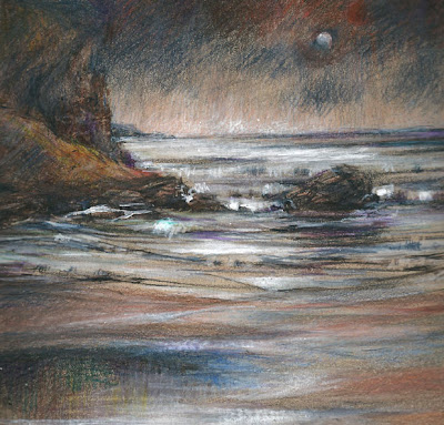
Mawgan Porth, Moonrise, coloured pencil and gouache on a deep buff paper Originally the cliff top showed more clearly against the dark clouds, paler.   It jarred, I didn't like it, so I sat down to create a lost edge - the cliff top edge barely visible against the dark cloud.  I like it better. This is another in that sketchbook with the deep buff paper - you can see it in places in this and the other images. I also added  a little white gouache to enhance the gleam on the water, moved the moon (with the flick of my hand!), added a ring around the moon and I'm happier with it now.. The clouds haven't scanned well  - they are softer with more subtleties and changes of colour than is picked up here.   I think it's finished. details:

amending past images, editing, reviewing and changing drastically : The bend in the river, coloured pencil and white gouache

Image
The Bend. Coloured pencil and white gouache This one was once a loud abstracted landscape, where I'd simply played with colour and the composition was frankly bad!  There was only a small distant patch of water in it, a lot more high foreground, looking downhill and the composition, viewpoint and subject were very different.  It wasn't something I wanted to keep but sat there - luridly - in my sketchbook.   The original and this were both just totally imaginary landscapes, based on a mix of visual memories.  I can't find a photo of the original - but you aren't missing anything! It's in that sketchbook with a deep buff coloured paper, a gift from a friend in the US.  Luckily the paper is strong and can take a lot of rough treatment. I used a mix of Jakar and Derwent electric erasers to 'draw' back into it, creating those paler trees, against a dark background, darkening the background further and simplifying,  taking out the distant dry reeds/hay, whic

Amending and editing old sketches: Clovelly, Devon, in coloured pencil

Image
  Clovelly Harbour, Misty Summer Day, coloured pencil and white gouache I was looking at this sketchbook with buff paper, thinking of working in it.  Instead I edited the 3 images in there.   I'd never been quite happy with them due to the whites being dull, making the whole image dull.   White pencils are very disappointing when used on coloured paper I find - I'd used 3 different brands in trying to get the whites brighter. I used a little white gouache, drybrushed where I wanted a gleam in the water, scrubbed a little into part of the wall of the house (but not all over) and used the small colour shaper tool that came in a set of Derwent tools to apply thin drawn lines of gouache for the edges of the waves. I'm much happier with it now.  This is also a better scan, bringing out the colours in the stone wall at the front and the water colour is more like the original.  Maybe it's having that white there to help it get the white balance to scan accurately? the i

Doodling with Graphitints

Image
Winter trees, approaching rain, Graphitints I was experimenting with water soluble Graphitints, which I've never used before.  The colours were perfect for the wintry weather we have at the moment.   This is looking out across the fields in that wonderful light you get when it's sunny where you are - but ahead is a deep dark threatening sky - such a wonderful mix. I liked the ability to create washes with these and also use them dry and the colours mixed well.  Drawing through a wet wash created stronger marks.   I want to get out more with these during the winter.

Review: Derwent Aquatones used with their waterbrush, a sketch of Cornish rocks and sea

Image
A quick sketch of the rocks and sea in Cornwall (from previous plein air work) to experiment with the Derwent Aquatones.  In A4 sketchbook. Derwent Aquatones: An early Christmas gift :>)  - I wanted to experiment with the Aquatones and see what was possible as I hadn't used these before.   They are a pencil made of solid pigment with a coating of paint to keep hands clean   They feel harder in use than the watercolour pencils and don't provide such a strong colour whilst dry  but colour still washes richly out when they are wet.   I found that the same scribble and pressure gave richer colour on the 110lb paper - the 75lb needing more pencil application or layers built up to achieve rich colour  ( the sketchbook reviewed in the previous post ). Colours mix well on the paper - something I need them to do.   Drawing back into wet washes made nice marks.   It is easy to wash out marks entirely (on heavier paper) or deliberately leave marks showing with only a lig

Review: Derwent 75lb hardback sketchbook , sketch of sea and rocks in Cornwall - added further media to Jan 2012

Image
edited 4.1.11   additional work in carbon pencil, ink, watersoluble graphite and more ........  Water soluble graphite and graphite pencil Near Porthgwarra , Derwent Aquatone pencils in Derwent 75lb A4 sketchbook  Back to painting and sketching - and testing out some early Christmas gifts.   First of all is an A4 75lb hardback using  a set of 24  Aquatone pencils and a waterbrush .   I'll do a review of the pencils and brush another day. I revisited my plein air sketchbooks and previous subjects of paintings, so that I could compare the variety of marks possible with work already existing, the depth of colour achievable, the ability to glaze colour and to achieve the translucency of water and colour mixing that happens in the painting, that I want. Sorry if you are tired, seeing Porthgwarra again!  - it's just a very suitable subject for the problem solving that I wanted to test these items against.  The changing colour of sea and sky, the water over the rocks, the g

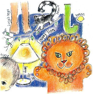
Illustrated ABC for Lucy, childrens book K and L and a new page for this book

Image
I've finished illustrating up to Z - so now the covers and then putting the book together in Publisher, printing and binding - nearly done! I'm putting the illustrations together on a page   - see the tabs at the top of the blog as those not interested in illustration may be getting thoroughly bored with these :>)   So  A-Z is uploaded there.   Covers to follow. And hopefully some 'serious' painting time soon.

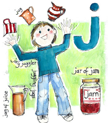
abc for lucy - illustrated alphabet I and J

Image
|Onwards ............

abc illustrated book - g and h

Image
The book continues - I've just realised I made changes to the G page and forgot to re-write the word giraffe. It's taking a lot of time but today and yesterday I had time off - family visits and then simply chilling and curling up with a book :>)

abc for Lucy - illustrated book

Image
and F - I did have a union jack there but it was too fussy, so simplified it to the cross of St George. The end is in view ......

illustrations for abc book: E

Image
  And E

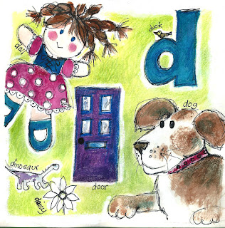
abc book illustrations up to D

Image
It's flowing faster at the moment - I'm actually up to K in colour and M sketched out and ready to paint ......

abc book illustrations continued

Image
Another page almost done.

illustrating a book for a small child continued - abc for Lucy

Image
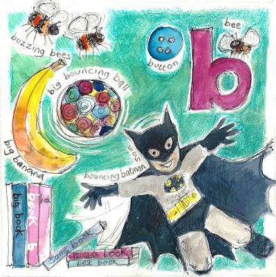
Now on to B - so many more to go and so little time! and the original with the print and added text - with typo - it should say big banana not bit! Only 24 more letters to go plus the covers, plus the putting it together with the writing in Publisher, plus the printing, plus the binding ..... no pressure then. And the original rough ideas sketch

An ABC book for a small child - continued

Image
I spent some time working on the illustrations for the book for my grandaughter, for Christmas, today.   It's a mix of watercolour, pen and coloured pencil.  And  I suddenly realised the rate at which I've got to work to get 26 letters plus covers, plus put the book together in time .....  I think I'd better get on with it quickly ! I think primary teachers will frown at some of the phonics - like the aeroplane and auntie C.   Some of the words like avaricious are aimed at brother Sam, who is very articulate and will enjoy the big words.  I wanted to bring in lots of family things  and thinking up enough items for the letters isn't the easiest! This is the A4 sketchbook with the original sketch below and above is a trial print of the page as it will appear with added text.  You may be interested in the working out ideas sketches here and here  .   Other illustration projects can be found by searching under the tag Illustration. A sketch still to be developed.

Framing - what frame to choose?

Image
Pollarded willows, charcoal and pastel in limed ash frame or black frame, framed it's about 3ft Selecting frames is difficult.   The frame can make or break a picture - but it also has to fit in with a buyers house. I notice this makes for a huge difference in opinions on framing between the US, UK and the continent when discussing framing with friends.  American friends always seem to go for dark dark wood, continental friends like more ornate frames, in England we tend to go for pale, minimalist framing - it so much depends on the surroundings in which they are to be hung as well as the image itself. Originally I had framed the piece above in limed ash with an antique white (pale cream) mat/mount but wasn't at all happy with it.   I hadn't thought enough about it.   The drawing has a lot of darks with compressed charcoal as well as deep colour, is 'heavy' and the frame didn't stand up to it, seeming too pale and insubstantial.   The pale limed ash, p