Posts

Showing posts with the label acrylic ink

Using ink and a stick to draw the contents of my desk, backlit aginst the sun

Image
sunglasses and eye drops, backlit,  ink drawing in A4 S&B Zeta sketchbook I've been neglecting my blog lately.   A mixture of a Mount Everest of marking and paperwork to do : >( and having had laser eye surgery.............. and being able to see without glasses (except for reading small print).  : >)    Yay!!!!!! I liked the backlit arrangement of clutter relevant to the surgery on my desk after I'd used the eye drops and decided to draw it.  It started off with some Herbin Gris Nuage but it didn't go dark enough for the shadows so I added FW acrylic Paynes grey ink and touch of their white ink to regain some highlights ,,,, then a small touch of Tombow pen.  The stick I used was a handle from a broken paintbrush, sharpened with a pencil sharpener.   I think I prefer the freer marks of twigs but it worked very well.  There was of course also water and a paintbrush for creating washes of paler ink. There were ...

Another in the jazz in paint, still life series, watercolour. charcoal and ink.

Image
A3 Khadi paper, watercolour, charcoal and ink, variations on a theme I've done a series of variations on this theme from the same original objects. Using sketches done from life I've then simplified, moved things around on the paper, played with patterns and in different media, rather like the way musicians plays with a theme, creating variations and counterpoint. I'm exploring the ways that still life can interest me as I don't find doing conventional set ups do. This one started with tinted watercolour washes, in a variety of greys that I mixed, developed with charcoal and white and paynes grey acrylic inks, with a little white oil pastel.  It's fun to work within a limited colour range like this. The Khadi paper is interesting to work on.  It's pure rag, heavy and quite absorbent so the paint doesn't sit on the surface as with some papers.  The paper is curling in the photo as it was still damp but it is actually square straight edged.   A...

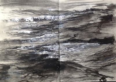
Rocks and waves near Bamburgh, Northumbria, charcoal and ink

Image
Rocks and surf near Bamburgh and Howick, ink and charcoal in an A4 S&B Delta sketchbook There were lovely long stretches of sandy beach but the rocks here were so interesting to sketch.   You can read about the geology here , so different from the rocks I'm used to sketching in Cornwall . This was done in a cold cold wind with willow charcoal and grey ink, plus some white FW acrylic ink from Daler Rowney.  I love that white ink.   I like the Herbin Gris Nuage ink to draw with twigs as I was here - but it ruins fountain pens : >(.  It was sold as suitable for them too.    Ah well, a fountain pen wouldn't have given me the expressive lines that the twigs did : >) You can see a drawing done with the grey ink using twigs here . I've now got several projects to juggle.  One for an exhibition and others for Christmas .... more to comel

Northumbria National Park, the hills above Alwinton, watercolour and mixed media

Image
Up in the hills of the Northumbria National Park, above Alwinton, Watercolour/mixed media in A4 S&B Delta sketchbook I absolutely loved it up in the hills of the National Park. As the single track road rose higher, the land grew wilder, bleaker and more dramatic.  The land folded, carved by glaciers and drystone walls zigzagged, showing the contours of the land. I painted a couple higher up as the sun was going down - I'll show those later. This one is a mix of watercolour, conte pencil,. coloured pencil, tinted charcoal pencil and a bit of white ink.   I wanted to get the different textures quickly and mixing media was the best way for me to achieve this. Below are a couple of photos from higher in the hills. I would definitely like to revisit this area.  The landscape and history are wonderful.

Watercolour and mixed media, Sennen Cove in S&B Beta sketchbook

Image
A sketch done from our holiday cottage in watercolour/mixed media in an A4 S&B sketchboo We had wonderful views from the house, right left and front .... and even the steep hillside/cliff at the back had primroses and bluebells. This is looking sideways when the tide is high, past a row of terraced cottages that climb up the steep track.  That's 'our' garden ..... for a week anyway! I used watercolour with some pen and a few touches of coloured pencil - oh and a little FW white acrylic ink, a new favourite medium, used with a bamboo pen or brush.  It is really opaque and a clear clean white. so useful for surf etc when you've lost the white of the paper in places,   I work fastish, the painting evolves and I don't always retain all the lights so use this or white gouache to regain them.  I like mixing media, choosing whatever will create the marks I want.  I'm trying to catch a spirit of place and have no interest at all in rules about 'pur...

Spring at last! Spring landscape in watercolour and mixed media

Image
Spring at Hartshill Hayes, watercolour and mixed media in Stillman & Birn A4 Beta Hardback sketchbook The family went off walking through the bluebell woods. which are looking absolutely gorgeous at the moment,   I sat at the top of the steep hill sketching.   Spring - a month late - is finally here and we had a few beautiful days.  It was warm and a bank holiday, bringing out lots of walkers, picknickers and those just wanting to sit in the sunshine - I left them out as it's the landscape that interests me. I used watercolour, coloured pencil, conte pencil, Derwent sienna drawing pencil, white Daler Rowney acrylic ink, touch of gouache .......and the kitchen sink! I have a few bottles of the FW acrylic ink and really like it but hadn't bought the white.   I asked one of my students how opaq.ue it is - I think he has the full set - and he said very .  So I ordered one - and it is :>)/   Just what I needed.  Even white ...

Trees and Moon at Dusk, winter, Grey ink and XL tinted charcoal in the S&B Zeta sketchbook

Image
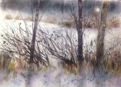
Dusk, winter, Grey ink and XL tinted charcoal in the S&B Zeta sketchbook An experiment across 2 pages of the new Zeta sketchbook with Grey ink and bamboo pen and Derwent's new XL tinted charcoal blocks.  Their new willow charcoal sticks are very nice too, really velvety unlike some that can be irritatingly scratchy. The charcoal is luscious and so are the tinted graphite blocks - well worth trying if you like to work larger and more freely. The Zeta sketchbook has very very smooth paper for those who use pen a lot and don't like texture.  It's also extremely heavy weight and can take a lot of pushing around, lifting out, washes etc The S&B sketchbooks are now available in the UK via Amazon and soon through Jackson's for anyone interested, I know a few people asked me for information. It's fun trying out new products :>) Now the weather is improving at long last I may manage to get out a little more to sketch. For those near the Cotswol...

gnarled branches, mixed media

Image
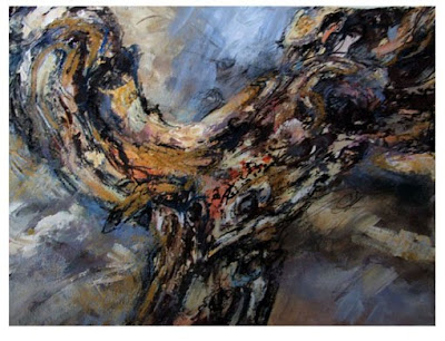
Gnarled trees branch, mixed media, 15 x20 inches, Vivien Blackburn This one is a mixed media study of a gnarled tree branch in acrylic, ink, a little charcoal and oil pastel. It's fairly textured with the paint quite thick in places. Done on a heavy watercolour paper. I've asked my students to bring me any interesting branches they find - I hope they do. I'd like to do some more. One has promised to keep her eye open for a skull as she often sees animal skulls when walking her dog - fingers crossed for this :>) I wanted to work larger and freer than the last one I did , which was also mixed media but much more restrained and smaller. What do you think?

Towards Dusk, another in the series

Image
Towards Dusk, mixed media and collage, 11x14 inches Another one in the series of birches. I've done more to the previous 2 and will show them when they are completed. I was adding the dimension of time to this - hope it 'reads' to others?

Playing with collage - demo for class

Image
Winter tree, collage, ink and coloured pencil. Vivien Blackburn A quick demo to some class members struggling with the concept of mixed media. Just scraps of coloured paper from the oddments drawer at college, some ink and coloured pencil for the branches and stylised grasses. I wanted to show them that it didn't have to be incredibly difficult or involved but could be extremely simple, fitting in with the kind of drawing they liked to do. I think it has a rather 1950s look to it do you?

Saltmarsh, mixed media painting - maybe finished?

Image
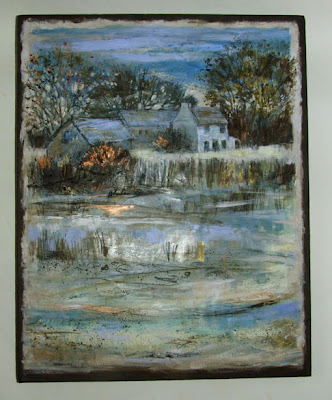
Saltmarsh - maybe finished? 20x16 ins, mixed media and collage on canvas, Vivien Blackburn The blue-mauve background that was surrounding the painting wasn't playing up the colours in the painting - instead it was fighting for attention with them. So I decided to change it to a deep bitter chocolate colour - burnt umber and cerulean blue, cooling and greying the brown. It's a colour that flickers throught the painting. It now highlights the colours and their subtle changes from warm to cool (that sadly don't pick up well in the photos) and emphasises the drawing. There is a very little black from the charcoal but all other darks are deep shades of brown and blue. I added flicks of copper in the leaves of the tree, in the tree on the left and in the reflections. I like the warmth against the other colours. That is also quite difficult to photograph being metallic. It's a bit more subtle in real life, the camera make it gleam too brightly - the second to last pho...

Dawn: Lavender, Viridian and Amber, acrylic on 12 inch canvas

Image
Dawn: Lavender, Viridian and Amber. 12 inch canvas. Acrylic. Vivien Blackburn Still in Christmas present mode! This is a present for my eldest daughter. She's moved into a new home and decided she wanted white walls and seascapes ..... a hint????? I did this one from references you've seen before but decided to combine elements from several. detail detail detail The colours aren't showing up quite right in the complete image. There is more of that viridian/eau de nil green in the water. The clouds are a slightly more subtle colour. Unusually for me, it's done entirely in acrylic - acrylic paint with some acrylic ink. I may yet add small touches of white oil paint with a palette knife to improve the sparkle on the water and the waves. What do you think?

new large A3 Moleskine - Folio books - REVIEW

Image
Moleskine Folio Books There are some new sizes of moleskine sketchbooks and watercolour books available - in much better sizes for creative images. They are now doing A4 and A3 in both the sketchbook and watercolour books. At the moment they are on a special introductory offer. They call them Folio books. acrylic ink over oil pastel in moleskine sketchbook I bought the A3 watercolour book . A3 for those unfamiliar with European paper sizes is equivalent to 2 sheets of computer letter paper side by side - about 15 inches across the landscape format page - so 30+ ins approx across a double page spread. A really nice size :>) A4 is computer letter paper sized at half A3. I like the elastic band closure and robust construction of my moleskine sketchbook, so, thought this was worth trying out. The previous small size of the 'large' watercolour moleskine meant I had never bought one. I believe the paper is the same. This book has the same format and pocket in t...

still life completed

Image
Still Life, acrylic, 16x20 ins. Vivien Blackburn I decided today to paint the edges (deep pthalo blue to work with the painting) of the still life I did a couple of weeks back and finish off bits I hadn't had time to complete. Here is the original post showing it as it was Reducing the size to this thumbnail makes it look a bit tighter than it is really. It's quite loosely painted. I like the way that the colours move through it better now what do you think?

something entirely different - for me anyway - still life

Image
Still Life with thanks to Sue and Jill. acrylic on canvas, 16x20 inches. Vivien Blackburn Still life isn't my usual subject but today was a 'studio day' with a group I belong to. There were models - a woman in the morning and a 10 year old Asian girl in the afternoon or a huge 6 metre still life, set up by members Sue Sansome and Jill Hailes . It's years since I painted a still life so I decided that I'd go for that option. They are both known for dynamic still life paintings so I knew they would set up something interesting. The colours and patterns changed along the length with spots and stripes and vividly patterned bowls, fruit, flowers - all sorts! I settled on this section of blues and yellows and touches of red. I lugged along oils and acrylics thinking I would want my oils as well but ended up completing the painting just with acrylic inks and paints. I moved objects around a little in paint, changing elements in the set up and tipped colour balanc...

Linoprinting - with a bit of virtual linoprinting too

Image
Linoprinting Linoprinting isn't my favourite form of printmaking but I felt like doing something different, something outside my comfort zone. Lino creates clear sharp graphic images and I am more comfortable with more painterly printmaking methods, particularly collagraphs and etching with aquatint but they do need a printing press and lino doesn't. This is the lino itself, I coloured the raised parts with waterproof ink to help me to see how the cut what going - the paler blues and mauves are actually cut away -that's just the remains of some acrylics that I tried that you can see. Printmaking is quite time consuming - there's a lot of 'process' - but once the plate is made, a number of prints can be produced from it. The number depending on the fragility or not of the lino plate . The idea is that you cut away any area you don't want to print. The areas you leave behind will be inked, usually in one solid colour but it is possible to do very effective gr...

mixed media seascapes on paper

Image
Across the Beach,Early Evening. mixed media on paper. 16 in sq. Vivien Blackburn acrylic ink, acrylic paint and charcoal A view across the beach in the early evening, warm tinted clouds, pools reflecting the light and the rocks - heavcn :>) if only I could win the lottery and live there. The light was terrible here today, grey and dismal - and I need a decent light to finish those ongoing canvasses as I need to look at them from a distance as well as close up. I thought I'd work on paper and work close to the window. I finished (I think) the one above The following one is at a mid-way stage. work in progress, approximately 18 ins tall acrylic ink and acrylic paint The last one may have some touches of pastel added. acrylic ink, acrylic paint and charcoal. Vivien Blackburn . .