Posts

Showing posts with the label abstracts

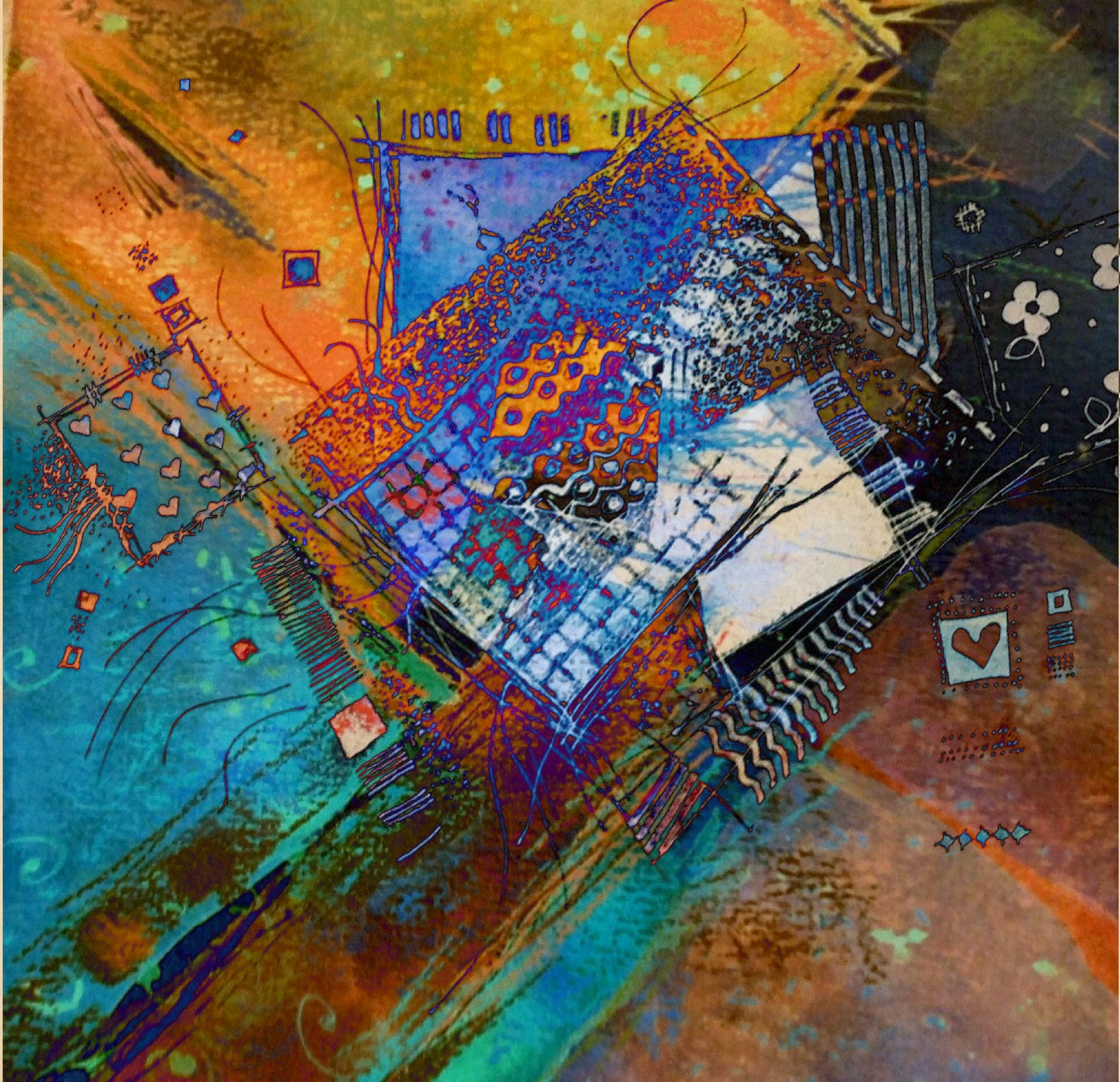
another in the Harlequin/Columbine series, this time a digital variation
Image
Digital image:  Harlequin and Columbine series This is another in the series, working out ideas for large paintings.  I see these on 4 or 5 foot canvasses.   Playing digitally with colour and shapes. These are abstracts based on the costumes of Harlequin and Columbine but about the patched and ragged fabrics, stage lights and time passing in the long history of the Commedia del Arte. What do you think?

New Year, flu and the Harlequin/Columbine project

Image
Columbine, digital variation I had flu immediately after Christmas and am only just recovering - I have never been so ill!  it was vicious and in the end needed antibiotics and high dose steroids.  But Christmas itself was lovely :>) So ..... the blog has been very neglected.  Here is an update on one of the Harlequin/Columbine series.   They are playing with the the idea of time, ragged and patched fabrics and stage lights.  This is a digital variation on the previous monochrome.  I'm thinking of including these prints as something in their own right, apart from them being a sketchbook stage in thinking ideas through.  I've done further work in a variety of media that I will upload, including scratchboard in black over copper, something I don't think I've used since school!  so more to follow ..... And Happy New Year

abstracting ... working around ideas

Image
A new project, working around ideas with ink I'm revisiting an old idea and developing it.   Some time ago I did a couple of abstract paintings based on the idea of the Harlequin costume from the Comedia del Arte.   One shown below is a 30x40 inch canvas. The one above was also trying out my new Sailor Flude pen - which I really like.  It's odd curved tip allows me to draw with the pen quite upright or tip it to make broad marks- the thickness of the lines in the sketch above were all done with the one pen, just angled differently. Harlequin.   Mixed media on canvas 30x40inches This time I'm looking at Columbine as well - her costume sometimes echoed the pattern of Harlequin's.   Costumes - the Comedia company were travelling players - costumes were often ragged and patched, which was the origin of the diamond pattern now seen as traditionally Harlequin.   I have got hooked on the raggedness as well as the patterns of...

Derwemt Inktense website and my image

Image
My commissioned  image on the Derwent website I was asked to provide an image using Inktense for Derwent, who were revamping their website.  It's now live.  :>)   .... and they forgot to add my name! It's about flowers rather than being any particular flower.  There are elements of poppies and Queen Anne's Lace and heaven knows what else in there.  Purely imaginary.  It's based on a large canvas I did some time ago. The original much larger canvas Inktense is one of my favourite Derwent produ cts (alongside the XL tinted graphite and tinted charcoal) .  I love the vibrancy and yet it is also possible to mix them to obtain subtle colours.   They are more transparent and luminous than ordinary watercolour pencils and because they dry waterproof I can build glazes and work over layers below as in my image that they used.   I use the pencils and the blocks. It was great to be asked - they previously used an ima...

Flower abstract: watercolour and mixed media

Image
 Abstract flower, A3 on Khadi paper with watercolour and mixed media Untitled as yet - any ideas? I went to an artist's talk last week and she demonstrated how she did her large scale flower paintings.  A good talk but  I wasn't keen on her methods or results - too methodical and literal for me, involving tracing photographs and carefully colouring in between the lines with layers of the same colour - but it did make me feel like doing another abstracted flower painting and just playing with colour.  So instead of working on the seascapes, I did this.  It's still subject to change!  there may be updates. Possible crop? It's based loosely on a slightly smaller pastel I did some years back.   That was loosely based on some beautiful bearded iris in the garden of a house in France we'd stayed in. The A3 Khadi paper I used is very absorbent and the paint sinks into it.  It also has a strong woven sort of texture.  The ...

More tiny abstracts: inktense, Derwent studio pencils and Fisher 400 paper

Image
Another in series of tiny abstracts, playing with the interaction of colour, shape and space This one was done using Derwent's studio pencils over an inktense underpainting, on Fisher 400 paper.   I like the way that Derwent's Coloursoft pencils work with this paper better, though these worked well, the Coloursofts were richer when used like this (not so on normal paper). Working with the underpainting allows me to create the same sort of effects that I can achieve in oils - changing subtly or overlaying very different colour opaquely,  and is a really useful way of playing with colour and ideas.   and another variation with the same materials  and there's more ..... I may arrange them in a grid, keeping each element small with the grid black or a deep linking colour - decisions decisions .... what do you think?

Derwent Coloursoft testing: Tiny abstracts, trees, seascapes, studies and ideas for potential large canvasses

Image
A series of tiny (2 inches and less) studies for possible large canvasses.  Derwent Coloursoft on Fisher 400 paper, underpainting in watercolours.   Vivien Blackburn  Tiny Abstracts with Derwent Coloursoft pencils  and watercolour on Fisher 400 paper: I had some tiny left over scraps of the Fisher 400 and decided to experiment with water colour washes, overlaid with Derwent Coloursoft pencils (which work beautifully over this paper, so intense and rich). As I'm not getting out to work plein air at the moment, due to the cold not being great for arthritis, I thought I might work on some canvasses where I'm simply using luscious colours to create space, mood and lovely interactions of colour. The Coloursoft on the Fisher paper allow me to throw in those unexpected intense bits of colour, over deeper washes beneath, like those touches of vivid red that float over the underlying colours.   Mixing media like this allows me to do this - to let the...

still life, non traditional approach digital manipulation

Image
Copper and Rose, digital image, Vivien Blackburn I experimented with the image from yesterday in the computer and this is one variation I came up with. I love the colours in this one - I must do this as a large painting. Still life is definitely starting to interest me!

snow

Image
photographs copyright Vivien Blackburn Back teaching today and I took the camera. I was planning to take some landscape photos pf the snow on the way - and I did, you'll find them on my photography blog - but I rather liked the footprints in the snow in the car park, the road markings and asphalt shining through. Lovely abstract shapes, tone, limited colour range and pattern :>) and the cars parking and reversing had made this fabulous row of hearts :>) OK - enough now. We really don't want any more. Well I don't. That's enough snow for the year now please - now let us head on towards Spring with a gentler, warmer winter .... Please?

some old digital images: variations on a theme

Image
Digital images - created with the computer and not existing in any other form. Vivien Blackburn I haven't done quite so much of it just lately but I do enjoy creating images on the computer, they aren't reproductions of anything, they just exist in their own right. These are some I did as part of my degree (done as a mature student). These 2 are further variations - season, weather, time changing the view. These take as long as a painting to produce as they were originally made up of many layers with many techniques and tools used along the way. I made digital images like this very limited editions with small print runs to take away the mass-produced perception of digital art. I believe it can be extremely creative - it's about what you do with it - rubbish in=rubbish out - but put some work into it as you would a painting and I think they can be amazing. What do you think?

digital flowers

Image
Experiments - manipulating the photographs I took this morning. Combining osteospermum flowers, begonias and poppy seedheads. and another version from the same beginnings .......

playing with colour fields in pastel, harmonious and complimentary colours

Image
Colour field experiments in pastel on pale grey paper. Golds and blues. Vivien Blackburn Colour field experiments. Pastel on grey paper. Blue, Violet and Gold. Vivien Blackburn These small pastels - just over 5 inches square, were pure 'playing' with colour interaction - taking complimentary colours and making vibrant little squares of colour as the complimentaries zing against each other. The second one hasn't photographed very well - the magentas are much more glowing in reality than they appear here. Colour field experiment in pastel on grey paper. Greens and Russet. Vivien Blackburn The last one makes me think of apples and autumn, the middle one of beaches on one of those deeply vivid blue days and the first late summer harvest time. They were done with Inscribe pastels, which is a very cheap brand but really nice to use and with a wide colour range, I use them alongside my Unisons. I do love the vivid colours of pastels and the kind of marks they make - that lovely...

why mix media? why not stick to just one as in 'pure' watercolour?

Image
detail of mixed media painting using watercolour, collage and oil pastel. Vivien Blackburn During the talk I gave at the sketchclub on sketching and sketchbooks, we also talked about using mixed media. Some people beginning painting imagine that if they use for instance, watercolour, then they must use only watercolour - or at the most pen and wash. There is a perception that this is more 'pure'. In actual fact using a mix of media can mean far more exciting paintings. There isn't any particular merit in keeping a painting purely to one medium - though there's also no rule against it :>D I love the extra visual language possible by using another medium - the velvety texture of Unison pastels used with watercolour - the range of marks is so much more varied all those lovely things watercolour can do plus the direct bold marks of pastel :>) mixed media - from Beacon Hill, plein air sketch in watercolour, charcoal pencil and pastel. Vivien Blackburn This plein ai...

Artist Frank Bowling

Image
painting by Frank Bowling I was reminded of the work of Frank Bowling when I came across a catalogue I'd bought a few years ago at an exhibition. His canvasses were huge, full of light, colour and texture - utterly beautiful. you can see more of his work on his website: http://www.frankbowling.com/index.html - Casey I'm sure you 'll like his work. :>) .

Prints at Costco

Image
Autumn. Vivien Blackburn I never really 'did' the reproduction print route but last year decided to set up an Imagekind account. I'd heard good reports of them. My reasons were mainly to do with the fact that digital imagery interests me and I do very small editions of digital works - it blurred the distinction between 'original' prints done via computer, where the image existed only in digital form and the reproduction of paintings. Well, Imagekind are linking with Costco and selecting some images to sell in Costco stores - and they selected this one of mine. I don't know if anything will come of it or how it will go. Profits are very small but potential sales bigger - I thought it was worth saying yes and trying it out - nothing ventured, nothing gained :) - what do you think? .

work in progress, seascapes stage 3

Image
work in progress. 40 inch square canvas. Wild Seas. Vivien Blackburn The beach is a typical Cornish cove - funnel shaped - so the waves come racing in and clash from different directions, bounced off the rocks, as they are forced into an ever narrowing route. I love the chaos and tumult. The sand is carved into hollows and ridges and patterns as the tide moves. I don't know how well I'm going to be able to catch this but it's what I'm trying to catch. My Monday class doesn't start up for a couple of weeks so I managed another day of working on the canvasses :) I'm now at the stage where there is a lot of thinking time or waiting for paint to dry and progress slows. 30 inch canvas work in progress stage 3 - seascapes Vivien Blackburn This one is the most resolved so far. A quieter day, looking diagonally across the beach when the tide is out. The evening clouds a soft apricot. I still have work to do on it though. 30 inch canvas work in progress seascape. Vivien...

beginning new seascapes

Image
start of a new seascape 40 inch square canvas I've started on some new seascapes. They are based on the sketches I did in Cornwall and memories of the beach at all times of day with the waves crashing and the light and weather constantly changing. I'm abstracting from them - I want these paintings to be about how I feel about the spirit of the area and not simply a realistic interpretation of it. I now have to let these early marks dry before I can continue and as I'm still having to work extra hours it won't be a fast process :( start of a new beach painting 30 inch square canvas These are at a very very early stage and have a long way to go. Hopefully a lot of these marks will remain in the finished piece but there are many layers and adjustments to go - I don't have a clear pre-worked-out result in my head but simply an idea of the feeling of the particular weather and light and moment that I want to recapture. As the painting develops it may change dramatically...