Posts

Showing posts with the label layering

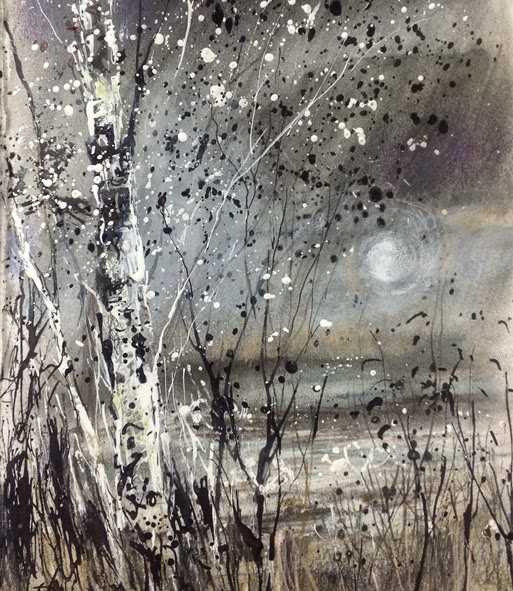
Drawing over a boring previous sketch and playing with mixed media: Trees
Image
Sketch in acrylic ink, tinted graphite and a touch of coloured pencil I currently have all my classes looking at trees at the moment - considering the individuality of them, looking at various artists past and contemporary.  Contemporary includes some friends and also artists I don't know but admire , these include Bridget Hunter. Glen Heath, David Parfitt, David Prentice, David Tress, Kurt Jackson, Shirley Trevena, Cheryl Culver and lots more. I don't have time to add links, sorry,  but google them if you are interested?  Past includes Mondrian, Klimt, Van Gogh, Monet etc etc etc  I really like Mondrian's trees and Klimt too. There was a page in a sketchbook where I had experimented with tinted graphite, doing a moody image of rain approaching across the bay.  It was just a tester and was quite boring.  I decided to work over it, keeping it as background and working in grey and white acrylic ink (plus a little more tinted graphite and a touch of co...
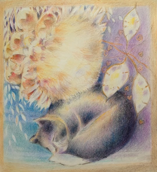
Experimenting with still life, coloured pencil in A3 moleskine sketchbook

Image
  Cat carving and cardoon by lamplight, coloured pencil in A3 moleskine Still looking at the items on the shelf above the tv but moving them around on paper, rearranging and looking at pattern and colour.  They aren't in the positions I've drawn them in at all and I've simply used the colour of the vase, though lightening it, not wanting the vase itself explained.  The same with the wheat and hearts patterns.  Warm light from the lamp and the cool lavender shades are observed so that the whole thing hangs together. Below are the earlier stages as it evolved.  I only have a rough idea of the final piece when doing this, unlike a traditional set up, where everything is where it will be in the image.   It evolves as I go.  Major elements like the cat carving, cardoon, blue of the vase and the honesty are decided immediately - they are the skeleton that everything hangs on.   Decisions about depth of tone, lost edges, patterns...

Snow and late afternoon light. iPad painting

Image
Painting from memory; a fabulous late afternoon with fresh snowfall, low sun throwing apricot through and bouncing off the dark clouds and the snow. I stopped on the way home to look at the gorgeous light on the landscape.  The furrows and tyre tracks in the ploughed field made a beautiful pattern on the hillside, with smooth snow n the adjacent field. The low sun threw apricot light on the snow and shone through the dark clouds. It didn't last long.   By the time I'd driven for maybe 5 minutes it was gone, the sky was all dark clouds or grey.  So this is from memories.  I did take some photos but didn't get them out when doing this and the previous one, I started it off in the Pen and Ink app The image was then imported into Sketch Club and I painted it on a layer below with some final touches on a layer above the 'pen' sketch. I like this ability to use layers - it replicated using a watercolour wash over a pen sketch and then using a little...

Snow and late afternoon light

Image
Travelling home in the late afternoon the light was beautiful. The pattern of ridges and tyre marks in a ploughed field made sweeping patterns, defining the form of the land. The low sun reflected apricot colours on clouds and snow. And then a flock of birds took off from the field, making a beautiful moment even more special. I have to do some paintings from this, but for now I've just had time to do some sketches on the iPad. This is a test post from the iPad so I'm hoping it works ok.

Using Diptic and Photoshop Express photo editing apps on the ipad

Image
Using Diptic and Adobe Photoshop Express Apps Diptic and Adobe Photoshop Express Apps for the iPad review I've used these 2 apps with photos here, but of course they will work equally well with art work, digital or analogue :>) I like the above image - it's a montage of my youngest grandson at Christmas  :>) I put the pictures together in an app called Diptic  - which has a variety of grids you can choose from (and edit) to create montages.   You can move the images about and enlarge or reduce them within their grid.   These were all cut from larger photos. It's very very simple to use and well worth having if you want to create this sort of compilation. The images were dropped into the grid, the text added and the whole changed to black and white in Diptic, then in Adobe PE I gave it a grainy texture.    I think these grids work best in black and white or sepia - or in the Warhol like effects of the thermal camera or similar....

drawing and painting programmes for the ipad: OmniSketch, and a little photography with the thermal imaging camera on the ipad

Image
Taken with the thermal image option on the ipad   A preliminary look at the apps for art and photography on the ipad that I've experimented with so far, some were deleted as rubbish but I didn't keep track of the names,  though I know Glaze was one, sorry!   ....... OmniSketch  A free app. This one was a lot of fun and my grandchildren enjoyed it as well (aged 2 and 5).  It is a little like the Mr Doob Harmony programme for pc I've shown here before, with interesting marks working on algorhythms. I really enjoyed experimenting with the way the marks interacted with each other and the difference that speed and pressure made.   The colour palette was a colour wheel , so lots of choices and the ability to choose close colour or tone, creating a reasonable amount of subtlety in finished pieces. The symmetry option was good - finished images sometimes felt as though they would work well in embroidery or stained glass or as a repeated...

working back and forth continued :)

Image
Lindsay asked: Vivien, thanks so much for this detailed explaination. I like how you are discussing the back and forth part. I feel that with charcoal too but never thought about it with oil paint. Oil Pastels can't be worked this way because the lights look muddy on top of the darks. I can't wait to start in oils.You probably did answer something just like this earlier. I was still thinking more along the lines of drawing rather than painting. I am finding painting requires a much different way of thinking. So your information probably zoomed over my head.Few more questions? Are you using black or mixing your darks from complements. Its hard to tell in the winter scape.And are you using a flat brush or rounds or both?Again, many thanks for such an in depth,multi media answer. so .... here goes, I'm answering here because it follows on from the last entry .... I don't use black to darken colours - virtually never ever. I use complements like alizarin crimson with viri...