Posts

Showing posts with the label still life

Using ink and a stick to draw the contents of my desk, backlit aginst the sun

Image
sunglasses and eye drops, backlit,  ink drawing in A4 S&B Zeta sketchbook I've been neglecting my blog lately.   A mixture of a Mount Everest of marking and paperwork to do : >( and having had laser eye surgery.............. and being able to see without glasses (except for reading small print).  : >)    Yay!!!!!! I liked the backlit arrangement of clutter relevant to the surgery on my desk after I'd used the eye drops and decided to draw it.  It started off with some Herbin Gris Nuage but it didn't go dark enough for the shadows so I added FW acrylic Paynes grey ink and touch of their white ink to regain some highlights ,,,, then a small touch of Tombow pen.  The stick I used was a handle from a broken paintbrush, sharpened with a pencil sharpener.   I think I prefer the freer marks of twigs but it worked very well.  There was of course also water and a paintbrush for creating washes of paler ink. There were ...
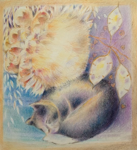
Experimenting with still life, coloured pencil in A3 moleskine sketchbook

Image
  Cat carving and cardoon by lamplight, coloured pencil in A3 moleskine Still looking at the items on the shelf above the tv but moving them around on paper, rearranging and looking at pattern and colour.  They aren't in the positions I've drawn them in at all and I've simply used the colour of the vase, though lightening it, not wanting the vase itself explained.  The same with the wheat and hearts patterns.  Warm light from the lamp and the cool lavender shades are observed so that the whole thing hangs together. Below are the earlier stages as it evolved.  I only have a rough idea of the final piece when doing this, unlike a traditional set up, where everything is where it will be in the image.   It evolves as I go.  Major elements like the cat carving, cardoon, blue of the vase and the honesty are decided immediately - they are the skeleton that everything hangs on.   Decisions about depth of tone, lost edges, patterns...

It's cold outside - so experimenting with still life in coloured pencil

Image
Study for a larger work, coloured pencil in A4 moleskine, honesty It's cold, very very windy and raining cats and dogs.   I'm lucky that we aren't affected by the terrible floods affecting large areas of the county but I still don't want to go out in it!  So I'm continuing to look at still life, a subject that I rarely do as a finished painting, preferring to do occasional studies of things that interest me and concentrating mainly on landscape. The items on the shelf over the tv, lit by a table lamp caught my eye - a vase of honesty, wheat stalks and a large cardoon head, a carved wooden cat, some carved abstract birds on a tree, the lamp and a bright pottery cat.  So .... how to make a different arrangement of them? playing with colour and pattern, not simply doing them ' as is ', which didn't interest me. Switching the lamp on gave wonderful colour contrasts, the shadows having a positive lavender colour and the highlights a warm amber.  Lig...

still experimenting with still non conventional still life, working out elements in A4 moleskine

Image
Carved wqoden cat in Crayola and Tombow pen in moleskine sketchbook A probable element in the next still life painting - it will be based on the things on the shelf above the tv. Done really fast with my grandson's Crayola pencils, some of which don't work very well on the waxy moleskine paper (but what's new!  so many things don't) and grey and black Tombow pen. I'm wondering if the finished painting might be done in Artbars and Caran d'Ache Neocolor II.   I think the ability to use  coloured line and wash might work with this and the other objects.  I'm also thinking it will need to be a full sheet of watercolour paper to weave the different things together in the way I want. Sketches to do and problems to solve ....

Another in the jazz in paint, still life series, watercolour. charcoal and ink.

Image
A3 Khadi paper, watercolour, charcoal and ink, variations on a theme I've done a series of variations on this theme from the same original objects. Using sketches done from life I've then simplified, moved things around on the paper, played with patterns and in different media, rather like the way musicians plays with a theme, creating variations and counterpoint. I'm exploring the ways that still life can interest me as I don't find doing conventional set ups do. This one started with tinted watercolour washes, in a variety of greys that I mixed, developed with charcoal and white and paynes grey acrylic inks, with a little white oil pastel.  It's fun to work within a limited colour range like this. The Khadi paper is interesting to work on.  It's pure rag, heavy and quite absorbent so the paint doesn't sit on the surface as with some papers.  The paper is curling in the photo as it was still damp but it is actually square straight edged.   A...

Jazz with paint - experimenting with still life in watercolour

Image
Experimenting with still life - jazz in paint.  Watercolour and oil pastel I meet up with a group of friends, fellow painters, once a month and we critique each others work, talk about art, exhibitions. artists etc and put on exhibitions ourselves.  We all work very differently.   We decided to challenge ourselves to tackle a subject we rarely do - still life - and each find an angle on it that makes it interesting to us.  We've talked about doing a project on it for some time and decided to stop talking and start doing : >).  We all have to take an A3 painting to the next meeting.  This is mine so far. As usual, the photograph doesn't bring out some of the subtle colour changes : >( This is based on sketches I did a year or two ago- you can see some of them here , here , here and here . This one was done with watercolour on Khadi rag paper (A3) with some gold, copper,  orange and irridescent pale blue Sennelier oil pastel scri...

Drawing with pens, Rotring, Lamy, ballpoint, Sharpie and Tombow

Image
Sketches with a variety of pens, Rotring and Lamy fountain pens, a Tombow double ended brush pen, a Sharpie and a Parker ballpoint pen. In S&B Zeta A4 sketchbook, ideal for ink as it's smooth, heavy paper lets the pen flow. Examples are for a forthcoming class, showing some of the marks each pen can make, alone or with a water brush to create washes of tone with the water soluble inks.  I simply drew items from my pencil case. The last sketch, of scissors, uses a mix of fountain pen, Sharpie and Tombow. The grey Tombow giving varied washes of tone, the fountain pen with black ink for fine lines and the Sharpie for flat, even, intense black. These are the pens I keep in my pencil case.  The Rotring pen I bought many years ago nd I've never had any problems with it.  I'm giving the Lamy a second chance, the first one started off ok but the the ink just refused to flow no matter how much I cleaned it.  It did not impress me.  Friends l...

Tiny trainers in watercolour, coloured pencil, pencil and ballpoint pen

Image
Tiny trainers in watercolour, coloured pencil, pencil and ballpoint pen in S&B Delta sketchbook Another sketch of my grandson's shoes. He's only 14 months so they are very little :>)    Done in my S&B Delta. A4 size.

Derwent new watercolour paper pads - experimenting with sketching in various water soluble media

Image
Trying out Derwent's inktense, watercolour pencils, Graphitint, Graphitone, Artbars and more on their new watercolour paper pads Derwent Watercolour Paper Derwent have brought out some new watercolour paper pads , perfect for their water soluble pencils and crayons.   It's 140lb which is heavy enough for the amount of water I'd normally use with these - I wouldn't normally have huge wet washes. I tried out sketches of items from my sketching roll and various coloured pencils and crayons.  All worked really well, the surface was a delight to work on with colour flowing freely, with the potential to lose or keep marks as I wanted. Products used here were  Derwent watercolour pencils Derwent Inktense Derwent Graphitint Derwent Graphitone Derwent Artbars Derwent Aquatone Derwent Charcoal Pencil Rotring Art Pen ....  with sketches of their electric eraser, sharpener for pastels and waterbrush, just some of the things from my pencil roll ...

What are the essential, key elements in drawing and painting better?

Image
 Cardoon, detail, coloured pencil What are the crucial , vital, key elements in drawing and painting?  There isn't a hard division between painting and drawing - they blur into each other - for instance, charcoal is extremely painterly and paintings need drawing elements (with paint). For me the key elements are: observation and underlying drawing skills even in very free or very sketchy work, it's what makes it hang together believably -  it doesn't need to result in a photorealist image, just one where proportions and perspective and form are shown.  The observation in a Degas sketch is amazing, with life and vitality,  but not photo like.  The sketches of David Hockney or Van Gogh are made up of pattern and marks - but the landscape reads, uphill down dale and the woods and hedgerows flow. . good use of tone , showing the full range observable - this may be limited as in a subtle Gwen John interior - but more often has a wide range of con...

Review - Derwent Studio pencils: testing, drawing feathers, seascapes and illustration and Derwent A3 sketchbook

Image
Feathers, Derwent Studio pencils, approximately 7 inches square  detail   Derwent have given me some of their products to experiment with and review, so I'm like a child in a sweetie shop.  : > ) Some I have used for a long time but some are new to me.   I remember as a very small child visiting their pencil museum and my father explaining how 'lead' pencils were actually graphite - and owning coloured pencils made by them.  In those days obviously just the basic range - not the artists ones I choose now.   I can't remember a time when I didn't draw.   One of my earliest memories is posting scribbled 'letters' to my father when I was 18 months old and he was away in Gibraltar with the RAF. Here I've been taking a look at their Studio coloured pencils      The above study of feathers was done with a limited range of colours - unfortunately scanners and cameras find pale colo...

Framing - what frame to choose?

Image
Pollarded willows, charcoal and pastel in limed ash frame or black frame, framed it's about 3ft Selecting frames is difficult.   The frame can make or break a picture - but it also has to fit in with a buyers house. I notice this makes for a huge difference in opinions on framing between the US, UK and the continent when discussing framing with friends.  American friends always seem to go for dark dark wood, continental friends like more ornate frames, in England we tend to go for pale, minimalist framing - it so much depends on the surroundings in which they are to be hung as well as the image itself. Originally I had framed the piece above in limed ash with an antique white (pale cream) mat/mount but wasn't at all happy with it.   I hadn't thought enough about it.   The drawing has a lot of darks with compressed charcoal as well as deep colour, is 'heavy' and the frame didn't stand up to it, seeming too pale and insubstantial.   The pale limed a...

still life revisited

Image
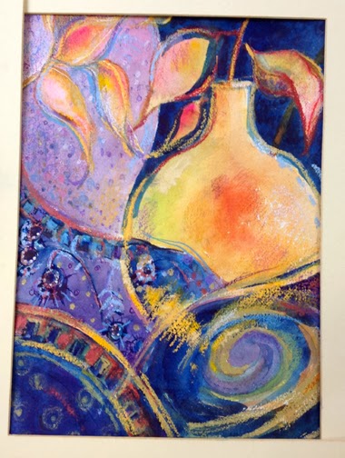
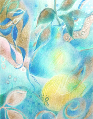
Blue, Viridian,Rose, Lemon and Bronze,  16 ins square on paper This one is based loosely on previous colour pencil still life experiments shown here on the blog earlier - but bigger and bolder and using water based media. I didn't want to do a traditional set up so the elements are moved around, abstracted a little, colours intensified and the division between pattern and reality blurred. The original coloured pencil sketches are here ,  here ,  here , here  , here , here and here . What do you think?  

work in progress: still life in coloured pencil stage 2

Image
Still life, stage 2, moleskine folio sketchbook - playing with patterns and composition I've worked a bit more on this one but there is still more to be resolved.   It's done in a mix of the Lyra pencils that I won and the Polychromos that I had.  There is a lot of layering of different colours to get subtle transitions happening. details: and potential crops for the finished piece: I like the squarer format of the second crop.  What do you think? Now time for decisions, what to change, what to lose entirely, what to darken, where to draw back into it with my Jakar eraser to regain light lines,  whether to erase the area outside the crop lines and leave an edge showing if I decided to put it in a mat  .......  push, pull, edit and change :>) Photographing it in dull natural light has made the colours much truer and shows the rosiness of the coppry/rosy leaves and vase better than in the stage one photos .

Work in progress: still life abstracted

Image
Work in progress This one is a development in a series I was working on - the original arrangement was very traditional, set up by a friend.   The colours appealed to me but not the arrangement, so I decided to play with the shapes and invent some patterns. The colours are terribly difficult to show as the coppery rose colours don't come out well - the vase and some of the leaf patterns are a really coppery rose colour and not as brown as they appear here.  There is also a lot more variation in the blues as they slide from greeny to puplish.  The coppery/rosy colours play beautifully against the turquoises and blues but it isn't picked up well by the camera :>( I moved objects around, played with pattern - leaf patterns on vases or material blurring into real leaves, the difference between reality and pattern blurred. It's one I can work on in quiet moments in the evening, when the TV isn't exactly absorbing.  It's in an A4 moleskine, which means I can...

Still life: quick sketch in Pentel brush pen

Image
Still life: Part of the mess on my desk! Pentel brush pen, A4 I've been really busy so no finished work to show - but this is a quick sketch, really really quick, of a corner of the mess on my desk! How much electrical/IT equipment we depend on - ipod, headphones, mouse, corner of the keyboard, external memory and the drawers with all sorts of useful bits in and the printer on top .... and that's just a fraction of it. I'm enjoying using the brushpen, it's very freeing, no fussing with detail - just quick fluid scribbling. I was pleased with how easy it is to get a mid tone using the side of the brush. I'd been inclined to only use it for line in the past.

STILL LIFE CHALLENGE and Pentel brush pen with charcoal, still life

Image
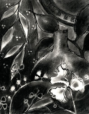
Still Life in willow charcoal, compressed charcoal and Pentel Brush Pen, 8x10 ins, Vivien Blackburn In discussions with friends recently I was reminded how nice the Pentel Brush Pens are to use - so I treated myself to a new one. The old one has long since been mislaid. It arrived this morning and so before doing all the stuff I should be doing, I had to have a play with it :>) I used to really like combining the brush pen with charcoal for all the lovely tonal variations and marks possible. The nearest thing to grab to work on was the work in the recent still life series - so here is a monochrome version done in willow charcoal, compressed charcoal and the brush pen. What do you think? The pen has a lovely fine point so it's possible to get a lot of line width/weight variation - finer than I remember. I bought the pocket sketching one - maybe that has a finer point than the regular one? I have to say that much as I love colour, I also really enjoy working purely tonall...

still life update

Image
detail I worked a bit more into this one - I like using coloured pencils but sometimes the effect can be a little flat to someone who likes marks - so this one has more loose marks with the Caran d'Ache than the purely Polychromos coloured pencil one done earlier. Here are some details to show the scribbliness. Is that a word? :>) further detail current progress The A3 page in the moleskine as it currently stands - I think I'm going to add a purplish border - you can see the tentative start of it on the left of the page. What do you think? another detail James Gurney has an interesting article about the contents of his sketching bag today - interesting to see it's not too minimal! (as one who takes too much) Billie I did harden some lines you'll notice :>) thanks

still life with caran d'ache neocolor II

Image
Experimenting with Caran d'ache Neocolor II in the A3 moleskine sketchbook - the paper tolerated me using water with these in the underlayers.

non traditional still life continued - another digital variation - and googleart

Image
Digital variation, Vivien Blackburn I fancy working from this one with scumbled paint over a coloured background. It needs to be either oils on canvas or pastel over paint I think. I love it when underlying layers of colour show through :>) And google ar t is waaay too addictive Look at the close up you can achieve of paintings, like this one of Turners. It's a fantastic site - how else could I visit the Tate, the Hermitage, The Rijksmuseum and the Uffizi and see pictures by moving around the gallery, and then closing in for a better view, without moving from my chair?