Posts

Showing posts from 2012

Drawing with the Pen and Ink app on the ipad - drawing of a tabby cat from life

Image
Quick sketch from life using the Pen and Ink app on the ipad, drawn with my fingers The free Pen and Ink app really does have the scratchy feel of pen and ink.  It comes with very limited tools and options but you can pay to have more.   I'm planning to stick with the free pen option on this one. I couldn't work out how to open the image in another programme with layers to add colour (on the ipad) so I did it on the pc - see below: With added colour I simply worked on a layer below the pen drawing, using the colour at low opacity, with the layer option set to Multiply, so that glazes of colour built up with transparency.  I'm sure this is possible on the ipad when I can work out how to move the image into a suitable programme.   I know how to do the opacity/layers thing on the ipad in other apps - it's the moving an image into another app that I can't do. sketch of winter undergrowth using pen and ink app on the ipad, using a basic Colt stylus pe

drawing and painting programmes for the ipad: OmniSketch, and a little photography with the thermal imaging camera on the ipad

Image
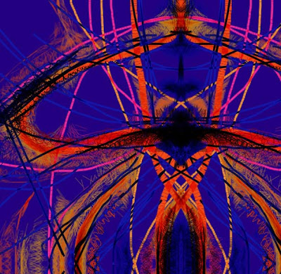
Taken with the thermal image option on the ipad   A preliminary look at the apps for art and photography on the ipad that I've experimented with so far, some were deleted as rubbish but I didn't keep track of the names,  though I know Glaze was one, sorry!   ....... OmniSketch  A free app. This one was a lot of fun and my grandchildren enjoyed it as well (aged 2 and 5).  It is a little like the Mr Doob Harmony programme for pc I've shown here before, with interesting marks working on algorhythms. I really enjoyed experimenting with the way the marks interacted with each other and the difference that speed and pressure made.   The colour palette was a colour wheel , so lots of choices and the ability to choose close colour or tone, creating a reasonable amount of subtlety in finished pieces. The symmetry option was good - finished images sometimes felt as though they would work well in embroidery or stained glass or as a repeated pattern in fabric.

Merry Christmas everyone

Image
Wishing all my readers and friends a very Happy Christmas.  Someone sent me this great poem one year - 2 ca ts is even worse, especially when you've left it to Christmas Eve to start wrapping ......... Wrapping Presents with a Cat Clear large space on table for wrapping present. 1. Go to closet and collect bag in which present is contained, and shut door. 2. Open door and remove cat from closet. 3. Go to cupboard and retrieve rolls of wrapping paper. 4. Go back and remove cat from cupboard. 5. Go to drawer, and collect transparent sticky tape, ribbons, scissors, labels, etc. . . 6. Lay out presents and wrapping materials on table, to enable wrapping strategy to be formed. 7. Go back to drawer to get string, remove cat that has been in the drawer since last visit and collect string. 8. Remove present from bag. 9. Remove cat from bag. 10. Open box to check present, remove cat from box, replace present. 11. Lay out paper to enable cutting to si

Using the iPastels app in ipad, my review

Image
sunset study with the Pastels app on ipod The ipastels app on the ipad is good to use, a definite keeper.  If you like using pastels this is defintitely worth trying out. I've downloaded several .....  umm  quite a lot.... of apps to try out, those that I don't like will be deleted eventually. As I've downloaded this I can't tell if it was a freebie or a bought one, sorry but it doesn't show any more once it's purchased - but the prices for any I bought were very low, all under £3. It's very simple to use with all the options clearly laid out and quick to access. You can work on different layers, preserving the layers beneath while you experiment.   I haven't used this yet but have worked in a similar way in Photoshop and know how handy it is. The image above was done on a single layer. You can vary the stroke width and pressure, meaning colours mix very naturally, thin veils of colour can be laid down and subtle transitions made, the sm

more ipad sketching

Image
more sketching with omnisketch and close up detail I think some of the earlier doodles would have worked well as stained glass windows with the light glowing throught them - this one I see as an embroidery.  If I had the talent I'd have a go at doing one! What do you think? and thank you for the app suggestions, they've been extremely helpful. And as a teaser - Derwent have got a really gorgeous new product coming out next year.   I can't tell you about it but I'm going to get to play with it :>)  I did have a really quick secret go when I was demo-ing at the NEC in October and LOVED it!  The hitmen would be after me if I told though :>D

more christmassy doodling on the ipad

Image
   detail of drawing below More drawings on the ipad, using Omnisketch.   Isn't the blue/purple luscious against the firy reds and oranges? entire drawing using omnisketch I've shown details as the fine marks don't show otherwise. detail of above image Still loving it!   I have to work out how to get these directly from the ipad to the blog - if anyone wants to leave instructions in the comments I'd be delighted,  So far I've emailed them to myself and posted via the computer.

sketching with an ipad

Image
Drawing with an ipad detail showing the marks My Christmas present to me, from me, for having had a horrible year was an ipad.  Friends have given me masses of great advice on which apps to download for art (and others).   Any more advice on apps is welcome. This one is done with OmniSketch and it works on algorhythms, rather like the programme by Mr Doob that I've used here before.  It's lovely for creating rich patterns and this one was done using an option that creates the symmetry as you go.  Lines relate to each other, depending on nearness and the speed of your hand as you draw, creating fine spidery marks linking them.   There is a gallery of paintbrush, mark making options.  It's fun! I've got Brushes - as used by David Hockney - and Procreate, which I'm told is good but haven't seriously played with these yet.  I got hooked into the rich, decorative Christmassyness possible with Omnisketch. I have to say that the ipad is very very user

careless observation and correcting a painting!

Image
error corrected - that doorway, gouache and tinted charcoal pencil Looking at that doorway again, I realised that with talking, teaching and not paying proper attention, I'd got the proportions of that downpipe way out!  I'd been reading it as a dark piece of wall (working from a photo in the warmth  in class on this one and I doubt if I'd have been so silly if I'd been working from life, bad print on typing paper too). So .... it was a case of washing out the offending area to narrow the pipe and then adding the sliver of bricks  and matching the suggestion of the steel shutters.  Thank goodness it's easy to lift paint from the S&B paper because of its brilliant sizing.  So today's class had a demo of washing out mistakes!

Urban sketching with my Stillman and Birn Beta hardback book, watercolour and Derwent tinted charcoal pencils and a question about ipads

Image
Faded grandeur,   an A4 sketch of an Edwardian? Victorian? doorway, sandwiched between the shutters of adjacent factories.  Watercolour and tinted charcoal pencils I pass this door frequently and had never noticed it until a friend pointed it out!  This fascinating sliver of  ornate carving and tilework of the original building, now largely hidden and framed by huge modern metal shutters.  It's patched, distressed surface was fascinating and I may well do some close ups of that as it doesn't show so well at this scale. I've decided to extend the slow burning waterways project (city and county streams, rivers, canals, pools, flooded quarries etc) to include the city and the interesting or quirky or just beautiful-in-their-ugliness bits.  I'll keep this book just for this project and add the other urban stuff I've done to keep it together.  I'll probably keept the waterways element in the books that are already going. S&B  how about a pocket in the b

Cardoon seedhead in gouache and tinted charcoal in a Stillman and Birn alpha sketchbook

Image
Another cardoon seedhead, gouache and tinted charcoal in a Stillman and Birn alpha sketchbook Another quick cardoon.   This one had shed all its scales, leaving just the fluffy 'fairies' that carry the seeds - one is next to it, so delicate against the large heavy seedhead - and the bristly dried flower petals. More of the NEC doodles to come .....

Artbars, tinted charcoal, gouache and cardoon seedheads

Image
Cardoon seedhead in Artbar, Gouache and Tinted Charcoal Pencil One of my students, Toni, had promised me some cardoon seedheads and this week brought a big bag of lovely toothy/fluffy/prickly specimens. This one had lost virtually all its scales.  They are so much fun to draw.  It ended up with nearly half the class deciding to have a go.  Cue much concentration and muttering. This was done in my Stillman and Birn Alpha sketchbook (A4), with a mix of Artbars , gouache and Tinted Charcoal penci ls. Mine never did much good in my garden and sadly died this year.  It had wonderful sky blue flowers but only managed one in its first year, two in its second and none this year.   It probably needed more sun and lighter soil.  I did manage to draw it though.  I think these have the purple flowers like the one below, perhaps I'll try planting some of the seeds. Old, more detailed sketches of similar seedheads in other drawing media:   more details about these here

More doodling at the NEC

Image
Seedhead done with Artbars A5ish Another of the small pieces I did to show the different ways Artbars can be used, using some of the lovely subtle colours in the box along with the more vivid.  All work there was done on the new watercolour paper they devised to complement their water soluble media.   It's lovely, smooth and the colours glow against it. I do like the ability to use line and mass and switch constantly between with the same crayon. Had a great day yesterday catching up with old friends at an Open House full of great paintings, printmaking, felting, ceramics and glass.   Buzzing now :>) Will share some of the artists work later.

Doodling at the NEC

Image
Demonstrating Artbars at the NEC (techniques: washes, scratching through, drawing through wet paper, splattering and scratching flecks in a wet wash using the spritzer) I had a fascinating time at the NEC, demonstrating Artbars for Derwent.  The idea was that I would sit at a table using them in small images, showing the different techniques that could be used with them - subtle washes, wet in wet, lifting colour from the crayons. layering and scratching through, splattering etc etc  etc.   They have a really rich and varied range of mark making potential. I combined them at times with a little Inktense pencil or scrapes of inktense to create flecks of colour that would stay in place while I washed more colour of Artbar over them. Scarily, at the last minute Derwent were offered a 30 minute slot each day in a 'theatre' where I did a demo to an audience, complete with cameras, big screens and a microphone.    Scary !!!  Luckily the cameramen were great, helping set

Demonstrating for Derwent at the NEC

Image
Sorry for the long absence - recently I was at the NEC with Derwent, as artist in residence, more about that later.   They have used one of my images for the flier for their new art competition - take a look at them on Facebook or on their website for full details. And the other reason? October 2012   RIP

Stillman and Birn Epsilon sketchbook with Derwent Charcoal pencil, portrait

Image
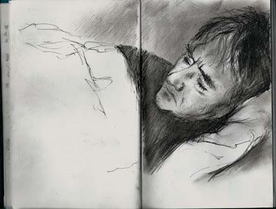
Sketch, charcoal pencil in Stillman and Birn Epsilon sketchbook I do like drawing in charcoal - I know it's messy, particularly if you use your fingers a lot to smudge out those soft greys as I do, but it's lovely to use : >)  and hands (and faces if you brush your hair back with charcoal covered hands) are washable. This is the Stillman and Birn Epsilon sketchbook that I grabbed quickly.  It has a smooth plate finish so I wasn't sure how it would work with the charcoal pencil - but the light and subject just cried out for charcoal.  They worked beautifully together.   The paper is heavy and though smooth, gripped the charcoal with no problems. I hadn't gone through the book folding the pages flat (starting from the centre) - I should have, because then the book lies totally flat and I would't have had that central gutter. The Derwent Charcoal pencil is lovely to use, giving dense velvety blacks but smudging to soft smoky greys or giving crisp dark li

Colour seascape from an old graphite pencil drawing: Derwent Artbars and Derwent A3 hard back sketch pad

Image
Detail of the rocks and grass I'm suffering withdrawal symptoms, not having been to the coast in ages due to family health issues.  So I got out some pencil drawings, done in a sketchbook last year, and decided to work from them in colour. I've sketched and painted in the area a lot over the years and  so have lots of memories of the changing colours - the turquoises and deep blues of the sea on a fine day, the jade/viridian of shallow water, the pink and mauve reflections on the wet sand, the misty soft colours of the far off rain clouds and the currents, movement and drama of the sea. The rocks here are sort of warm honey colours, though they change in less than  a mile to deep dark granite. detail 2 The finished image - which loses something in photographing it - the very  softest, palest colours never pick up well.  There are more pale, cool neutrals in the sand than show here.  Finished piece It's worked entirely with DerwentArtbars , with j

Illustrations and absence

Image
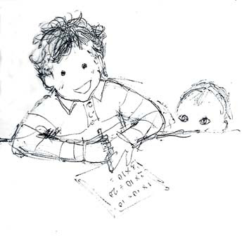
 Quick doodle, planning for illustrated book, Sam doing his tables, watched by Lucy, pencil in S&B sketchbook Sam is nearly 5 and addicted to maths (I'd think he must be a changeling if he wasn't the image of his father!)  so I thought I'd do a times tables book for him with illustrations. He was working out the odds on horse racing with his grandfather last week - having asked what the numbers 10:1 onscreen meant.  We were working out what happened if you put £3, £8, £10 etc on instead and what your winnings would be - he rattled off the answers.  Maybe not quite the way his teachers intended tables to be learned! This is a preliminary doodle, thinking how to go about designing the book. And these ............ ........... are ideas for showing the multiples for 5x and 3x - the problem is by the time you get up to 12x12, that's a lot of little images!  So how to solve?   Go for simpler shapes?  have fold out pages?   Things to doodle and work out bef

people sketching while waiting

Image
Little courtyard off the waiting room, people waiting to be seen by the doctor; Rotring pen, water soluble felt pen with waterbrush and Parker jotter in Stillman and Birn Gamma Sketchbook I'm seeing rather too much of hospital waiting rooms at the moment - but the weather was nice so we waited in a little courtyard garden, just off the waiting room, for our appointment - which of course was running late.   Sketching people out in the fresh air relieved the boredom considerably :>) Not great sketches - my excuse is that the models kept twitching and moving and crocheting and suchlike, making it impossible to do the woman's hands for instance  - for me anyway. I just can't enjoy sketching like this with my Rotring pen - I find nibs too scratchy.  :>(    (man on the top right).   I binned my Lamy pen because no matter what I did or how I cleaned it,  it refused to let the ink flow freely - not one I'd ever buy again - unless Lamy want to send me one that wo

Derwent's new watercolour paper

Image
Birthday card made using Derwent's new watercolour paper - gouache, Artbars and oil pastel A quick bunch of imaginary flowers for the birthday of my eldest daughter this weekend. I'm a bit late posting it so Mr Postman please be quick. I used the A4 paper and simply folded it - wrote the message in copper oil pastel inside and played with these flowers on the outside.

Gouache and Artbars landscape in the Stillman and Birn Alpha sketchbook

Image
Evening Light, Winsor and Newton Gouache and Derwent Artbars in the A4 Stillman and Birn Alpha sketchbook. Further experimenting with gouache, Derwent Artbars and Stillman and Birn sketchbooks. This was a demo to students about the benefits of working on a dark background when painting moody scenes.   I scribbled various deep colours with the Artbars and then washed them into a streaky deep background.   Then with gouache I worked over it - thin glazes and thicker paint - then worked back in with the Artbars in places.  Leaving parts of that dark background as tree trunk, far trees, some of the field, scratching through to the darkness below for fine lines and marks.  The pale flowers in the foreground were done with white gouache, flicked from a bristle brush to keep the marks random and free.  The combination of media worked well with lots of  variation in marks possible.

New arrival, sketch of newborn baby

Image
New born: very quick sketch of Charlie at 15 hours old, pencil in Stillman and Birn Gamma sketchbook This is one of the reasons I've been absent - new arrival Charlie, my youngest daughter's first child :>) Other hospital stuff also going on with more sketches to follow and hopefully I'll catch up with the series I was writing.

How do you decide which size to work? and 3 abstract works in widely different dimensions

Image
Undergrowth: mixed media on canvas, 5ft wide x 2 ft tall  Katherine Tyrrell asks an interesting question on her blog today questioning  the scale in which you work and whether you work to standard sizes. She makes some very good points - but on conclusions I differ somewhat.   For me it's important to work to the size/format that suits you composition - and hang the cost!  (her first option in her poll)   Not because I'm wealthy - I'm quite the opposite!  Just because I think it's important that every bit of your chosen area matters .   I see so many good works ruined by an insistence on keeping the full size/format of the paper in order to fit existing frames : >(.  It means that parts of a composition are spoilt, areas sit there not earning their keep, destroying the tension of the composition.  Once students learn to crop to suit the work, and not their bargain frames, their work looks so much better : >) You can always use that frame but hav

Derwent new watercolour paper pads - experimenting with sketching in various water soluble media

Image
Trying out Derwent's inktense, watercolour pencils, Graphitint, Graphitone, Artbars and more on their new watercolour paper pads Derwent Watercolour Paper Derwent have brought out some new watercolour paper pads , perfect for their water soluble pencils and crayons.   It's 140lb which is heavy enough for the amount of water I'd normally use with these - I wouldn't normally have huge wet washes. I tried out sketches of items from my sketching roll and various coloured pencils and crayons.  All worked really well, the surface was a delight to work on with colour flowing freely, with the potential to lose or keep marks as I wanted. Products used here were  Derwent watercolour pencils Derwent Inktense Derwent Graphitint Derwent Graphitone Derwent Artbars Derwent Aquatone Derwent Charcoal Pencil Rotring Art Pen ....  with sketches of their electric eraser, sharpener for pastels and waterbrush, just some of the things from my pencil roll of sketc

Charcoal landscape sketch:Across the fields, in a Stillman and Birn Alpha sketchbook with Willow charcoal and Derwent charcoal pencil

Image
Across the Fields near Great Bowden A4 Stillman and Birn Alpha sketchbook, willow charcoal and Derwent charcoal pencil A charcoal sketch on a hazy but sunny morning with layers of spring growth.   First the long grass and cow parsley of the verge, some light against dark, some dark against light.  Then the hawthorn hedge - a complex mix of light and dark and gaps between twigs where the field could be seen through.  Then a field of growing wheat, a further hawthorn hedge, a bright yellow field of rape, a further hedge beyond which the land falls away to a valley -  and then the far hills, blue and hazy with a few distant fields outlined by more hedges and more yellow rape.  On the right a distant wood looking deeper blue.  Patern and tone. I had actually gone to sketch more sheep but they'd been moved to another field. Every year I mean to sketch the fields when these vivid areas of bright yellow are there and usually don't make it in time.  Soon the petals will fal